
You've found a paint color you like, but it looks bright in the store and heavy at home. The difference may come from the room itself. Window direction, room size, artificial lighting, flooring, wood tones, and upholstery can all change how a color reads. A shade that feels airy in one office may look washed out or overly dark in another.
These home office color ideas focus on real design decisions rather than one universal “best” color. You'll see how each palette affects visual balance, mood, lighting, furniture pairings, video-call presentation, and everyday maintenance. You'll also find practical ways to test a swatch beside your desk, flooring, chair, and camera background before committing.
Woodstock Furniture & Mattress Outlet's home-office furniture, décor, Design Center, and Room Planner tools may help you compare desks, seating, storage, and accents as a complete arrangement. If your project includes professional repainting, this guide to commercial painting in Dublin offers useful context on planning and preparation.
1. Neutral Base with Accent Color
A neutral base gives your office a quiet visual foundation. Warm gray, beige, taupe, soft white, or cream can cover the walls and coordinate with larger furniture, while one accent color brings personality through a chair, artwork, lamp, or desk accessories. This approach suits shared rooms and renters because the major elements stay flexible.
Try warm gray walls with a navy desk chair and brass lamp, or soft white walls with terracotta artwork and a warm wood desk. Beige walls can work with emerald cushions on an office settee, while taupe walls paired with a burgundy panel behind desk shelving create more definition without requiring the whole room to become dark.
The neutral should respond to the room's natural light. Cooler grays may balance north-facing light, while warmer neutrals can complement stronger southern exposure, but artificial lighting and nearby finishes still matter. A neutral wall beside orange-toned flooring may look warmer than the same paint beside pale oak.
Keep the accent flexible
Use accents you can change without repainting. A blue chair, framed artwork, desk organizer, throw blanket, or lamp shade can shift the room's character as your preferences change. Natural wood helps prevent gray, beige, and white palettes from feeling flat.
Avoid treating saturation as a precise formula. Instead, choose softened versions of your accent color when you need long periods of concentration, especially if the office is small or visually busy.
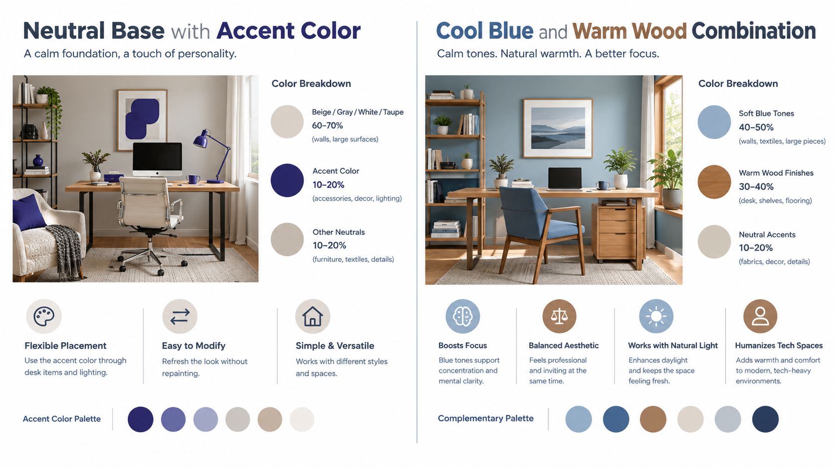
Practical rule: Paint samples on more than one wall, then view them in morning, afternoon, and evening light. A useful guide to painting wall patches can also help when you're preparing an existing wall for testing.
2. Cool Blue and Warm Wood Combination
A blue wall behind the desk can make a small office feel calmer and more open, while wood keeps the scheme from feeling cold. Choose among sky blue, periwinkle, slate, blue-gray, and gentle navy according to the room's light, size, and work style. Honey oak, cherry, walnut, and reclaimed wood each change the palette's visual weight.
Pair a light sky blue with a walnut desk when you want an airy backdrop with enough contrast for video calls. Slate blue with cherry cabinetry feels denser, so reserve it for a larger room or one wall behind the desk. In a compact office, lighter blue and medium-toned wood usually leave more visible breathing room around the furniture.
Color research offers a reason to test this combination rather than choose it by appearance alone. A 2026 peer-reviewed workspace study found statistically significant productivity differences across four wall-color conditions. Blue performed above green in that experiment, and participants reported more positive affect under blue and yellow than under red and green. The findings do not predict every person's response, but they support comparing blue samples when concentration, mood, and camera presentation all matter. Read the study's methods and findings.
Warm the cool side
Balance blue with a brass or copper lamp, then add tactile warmth through a jute rug, natural-fiber basket, woven shade, or wood accessories. Dark walnut generally benefits from a lighter blue, while pale wood can carry a deeper blue accent wall without making the room feel heavy.
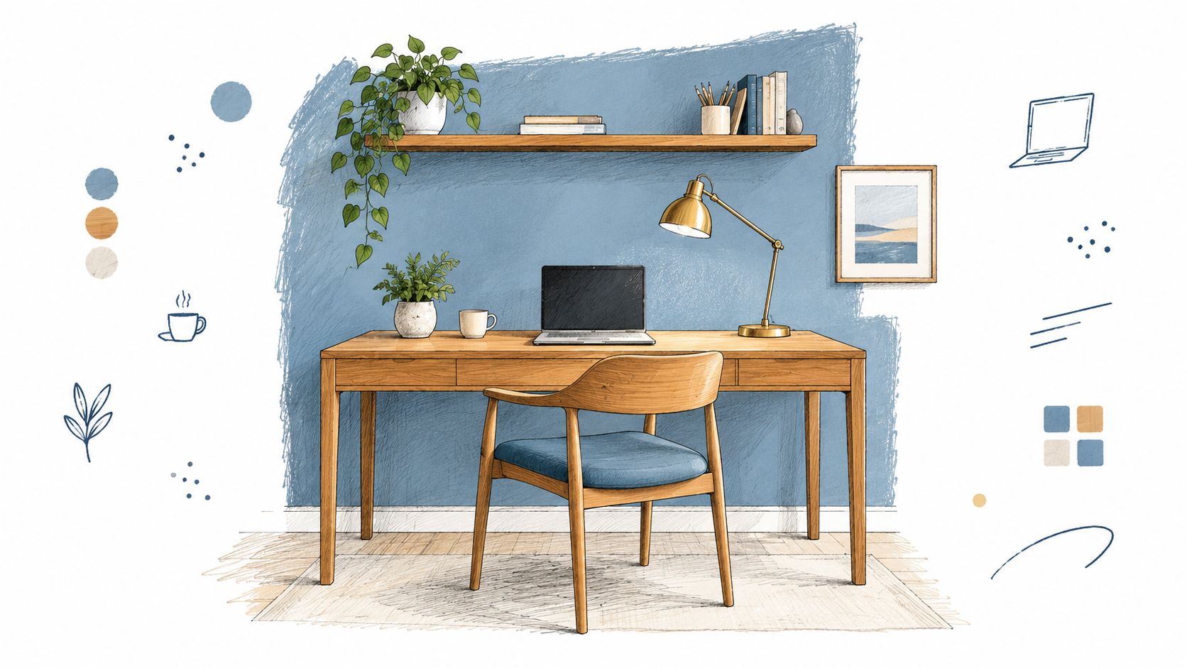
Test before committing. Tape a blue swatch beside the desk and within the camera frame, then check it in daylight, screen light, and evening lamp light. Compare it with your flooring and wood finish as well. The same blue may look airy, gray, or dramatic as the lighting changes.
3. Warm Earthy Tones with Green Accents
If afternoon light makes your office feel stark, warm earthy colors can soften the room without making it feel closed in. Try terracotta, warm tan, soft ochre, camel, or warm greige on the walls, then use green in plants, ceramics, artwork, or a chair cushion. The earthy wall color provides the visual weight, while green works like a smaller counterpoint.
A warm taupe wall can frame a tall pothos behind the desk and a sage cushion on the chair. An ochre accent wall may suit eucalyptus on floating shelves, while terracotta pairs naturally with succulents, a warm wood desk, and woven baskets. In a small office, limit green to a few deliberate placements. Too many leaves, patterns, and green accessories can compete with the desk and make the background feel busy during calls.
In the 2026 workspace study cited earlier, green trailed blue and yellow on both productivity and positive affect. That finding supports testing green as an accent rather than assuming an all-green room will suit focused work.
Let plants serve a design purpose
Match each plant to the room's actual light. A pothos, snake plant, or ZZ plant may be easier to maintain than a species that needs bright, consistent conditions. Use a taller plant to define an empty corner, but keep it below or beside the camera frame when you need a clear background.
- Large elements: Use one dominant earthy wall color and larger planters to establish visual weight.
- Medium elements: Repeat green in artwork, shelving, or an upholstered cushion.
- Small elements: Add green ceramics, notebooks, or desk organizers for continuity.
- Natural materials: Pair the palette with rattan, linen, warm wood, and a natural-fiber rug.
Order or paint a sample before committing. Place it beside the flooring, desk, plants, and camera background, then view it in daylight and evening lamp light. Terracotta may look muted beside warm wood but much stronger against cool gray furniture. If the wall feels too intense on screen, keep the earthy color on one wall and shift the remaining surfaces toward a lighter warm neutral.
4. Monochromatic Gray with Texture Variation
Gray can give a home office a calm, coordinated base, provided the room includes varied surfaces. Combine light dove gray, mid-gray, charcoal, off-white, metal, felt, linen, and wood so the eye moves through texture and sheen instead of unrelated colors. The palette works like a layered outfit: similar tones create unity, while different materials prevent the room from looking flat.
Start with the room's light and working style. Dove-gray walls, a charcoal upholstered chair, a brushed-metal lamp, and a textured gray rug suit a soft, quiet office. A greige wall with a gray linen chair, concrete-look organizer, and chunky textile feels warmer. Pale walls paired with a glossy charcoal desk and matte metal shelving create clearer contrast, while a medium-gray wall with light upholstery and dark filing storage gives a compact room more visual depth.
This approach suits existing furniture in restrained colors and leaves room for later changes. You can replace the chair, rug, or artwork without creating a conflict if their undertones remain compatible. Before buying, place large and small swatches beside the desk, flooring, chair, and likely video-call background.
Use light and surface deliberately
Gray changes noticeably with its surroundings. Limited daylight can make a cool gray feel dull, while warm bulbs may balance a blue-gray surface. Test paint on more than one wall, then view it in daylight, evening lamp light, and on camera. A small sample can look even, while a full wall reveals whether the room feels heavy or washed out.
Mix matte paint with brushed metal, soft upholstery, rough wood, and a woven rug. White or warm off-white can highlight shelving, trim, or artwork when the room needs sharper definition. Keep darker gray near the desk or storage if you want visual weight there, and reserve lighter surfaces for areas that need reflected light.
Research reviewed across 1988, 2007, and 2016 points to a practical caution: color responses can vary with people and exposure, so judge gray across a full workday rather than a brief glance. Review the color research history.
For a visual reference on combining gray tones and texture, watch this home-office example:
5. Warm White with Black Accents and Natural Materials
Warm white walls create brightness, while black details give the room structure. This combination works especially well when you want clear sight lines for video calls but don't want a stark, purely white office. Add light oak, maple, leather, linen, jute, rattan, or wool to soften the contrast.
A warm white wall with a light wood desk, black metal shelving, and a linen rug feels orderly but approachable. Cream walls can support a cognac leather chair, black-framed art, and jute baskets. For a more architectural look, use a black desk frame, natural wood top, and woven storage pieces.
Choose a warm white with cream, yellow, or gray undertones rather than assuming every white will look the same. Cool daylight can make a warm white feel balanced, while warm evening lamps may emphasize its creamy side.
Keep black in selected locations
Black works best when it defines an edge or anchors a feature. Use it in the desk frame, shelf brackets, curtain rod, window treatment, picture frames, or one substantial storage unit. Painting every surface black can reduce the room's reflected light and make a compact office feel enclosed.
Natural materials also add practical variety. Linen curtains soften glare, a rug reduces the hardness of a desk-and-floor combination, and wood gives the camera background a more dimensional appearance than a blank white wall.
Place a sample of the warm white beside the floor and chair fabric. Then check your camera at the angle you normally use. A wall that looks bright in person may appear harsh on screen if the desk lamp points toward it.
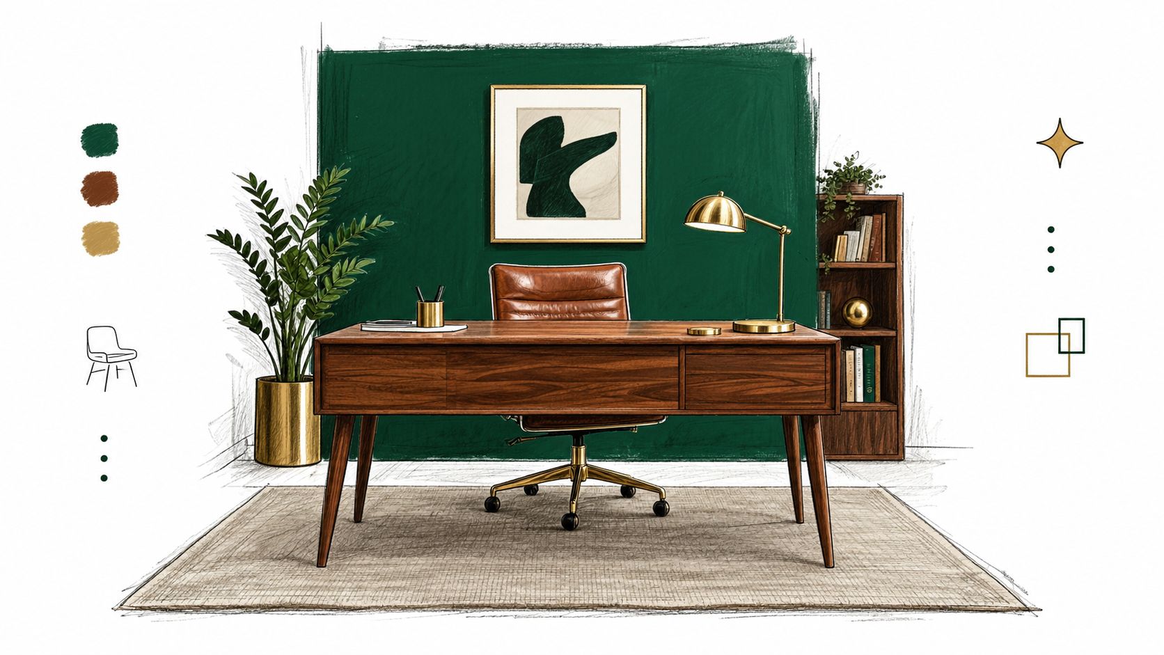
6. Deep Jewel Tones with Metallic Accents
Deep jewel tones can give a home office a strong visual identity. Emerald, sapphire, plum, and navy work particularly well on one accent wall or a large upholstered piece, while brass, copper, and warm gold add light-catching detail.
An emerald wall behind the desk can pair with a brass lamp, natural wood, and cream side walls. A plum wall with copper-framed art creates a warmer, more expressive setting. Deep sapphire works with brass shelving, pale walls, warm wood shelves, and a leather chair. These combinations suit people who want the office to feel distinct from the rest of the home.
The risk is visual heaviness. A dark wall may absorb more light, especially in a small office or a room with limited daylight. Support it with lighter flooring, a cream chair, pale art, or a natural wood desk.
Treat reflectance as a planning tool
Light reflectance value, or LRV, measures how much visible light a surface reflects on a scale from 0 to 100. A building-design reference recommends ceilings with reflectance of 80% or more, walls at least 50%, and floors at least 20%. These figures aren't a rule that every home office must follow, but they give you a way to think about how much light a darker palette may remove from the room. Learn how LRV affects paint specification.
Use a deep tone as a backdrop for the desk rather than covering every wall. Warm bulbs, layered task lighting, wood, leather, and wool can keep the room from feeling like a formal showroom. Test the color with your actual light fixtures on, because a jewel tone can shift from rich to muddy under weak illumination.
7. Warm Tones with Soft Blush and Rose Accents
Blush, rose, and dusty mauve can make a home office feel welcoming while keeping the palette restrained. Begin with warm beige, tan, or warm gray, then introduce the softer shade through artwork, upholstery, textiles, or one selected wall.
Warm beige walls paired with a blush chair and rose-toned abstract art create gentle contrast. Taupe can support a dusty mauve accent wall, warm wood desk, and rose cushion. For a smaller commitment, try rose-gold accessories, a blush rug, or peachy artwork against a tan wall.
This combination suits creative, design, wellness, and client-facing work where an approachable setting supports the room's purpose. Give the softer colors a firm visual base with a substantial wood desk, black or brass lamp, grounded storage, and framed artwork. These elements keep the office from feeling too delicate.
Sample the undertone, not just the color name
Blush may read peach, gray, beige, or violet depending on the paint and nearby materials. Place large swatches beside the flooring, desk finish, chair fabric, and window trim. View them in daylight and with the lamp used during work, since the same sample can shift noticeably between lighting conditions.
Camera lighting adds another test. Warm bulbs can make blush appear peachier and richer, while cool bulbs may pull gray or violet undertones forward. Record a short video from your usual desk position before painting, checking both your face and the background. Keep the strongest rose surface away from the area directly behind your head if it competes with skin tones or clothing.
- Use muted versions: Dusty rose usually adapts more easily than bright pink.
- Repeat the color lightly: Connect artwork with a cushion, notebook, or small accessory.
- Add natural texture: Wood, linen, woven baskets, and wool give the palette depth.
- Test the full setup: Move a swatch near the desk, chair, window, and camera before committing to a wall color.
8. Industrial-Inspired Gray and Black with Warm Accents
Industrial palettes rely on concrete gray, black metal, glass, exposed-style finishes, and raw-looking surfaces. Without warm counterpoints, they can feel hard or dim. Add walnut, honey wood, leather, brass, copper, terracotta, upholstered seating, and a rug to make the office usable for long work sessions.
A concrete-look accent wall with black shelving, reclaimed wood shelves, and a brass task lamp creates a strong work zone. Soft gray walls with a black desk frame and walnut top feel less severe. Black filing storage, warm floating shelves, and copper desk accessories can bring the look into a rented apartment without structural changes.
This palette suits technical and creative work because it gives equipment, books, and artwork a clear setting. It also photographs well when the background has varied surfaces rather than one uninterrupted dark plane.
Soften the hard surfaces
Use a textile under the desk or across the seating area. A fabric chair, throw, curtain, or rug changes both the visual balance and the acoustic feel of a room filled with metal, glass, and hard flooring. Warm lighting can also make gray and black materials feel more human.
A controlled home-office wall-color study with 51 participants found that light and saturated colors were generally perceived positively. Dark schemes were rated positively for being warm, pleasant, focusing, and beautiful, but they also scored negatively on several other attributes. That combination supports using darker colors for a focused wall or nook rather than assuming a fully dark room will suit everyone. Explore the home-office color study.
Test the industrial palette with your desk in position. If the wall feels too heavy behind the screen or camera, keep the gray on one wall and use a lighter neutral elsewhere.
8 Home Office Color Schemes Comparison
| Palette | Implementation complexity | Resource requirements | Expected outcomes | Ideal use cases | Key advantages |
|---|---|---|---|---|---|
| Neutral Base with Accent Color | Low, simple paint + accessories | Low, paint samples, small décor swaps | Calm, professional, low visual fatigue | Home offices, long-focus work, video calls | Timeless backdrop; easy, inexpensive updates |
| Cool Blue and Warm Wood Combination | Moderate, shade selection + furniture pairing | Moderate, quality wood furnishings, paint | Balanced focus and warmth; inviting professionalism | Tech-heavy offices, natural-light rooms | Promotes concentration; humanizes tech-heavy spaces |
| Warm Earthy Tones with Green Accents | Moderate, coordination of plants and tones | Moderate, plants, natural textiles, wood | Grounding, energizing, improved wellbeing | Creative work, wellness-focused home offices | Biophilic benefits; timeless, comforting palette |
| Monochromatic Gray with Texture Variation | Moderate, select multiple gray tones and textures | Low–Moderate, varied finishes, textiles | Sophisticated, low-stimulus focus with depth | Minimalist professionals, low-light spaces | Reduces decision fatigue; highly versatile with accents |
| Warm White with Black Accents and Natural Materials | Moderate, careful contrast balance required | Moderate, quality finishes, natural materials | Clear, organized, warm-minimal aesthetic | Small offices, client-facing video calls | High-clarity visuals; timeless, professional appearance |
| Deep Jewel Tones with Metallic Accents | Moderate–High, lighting and proportion critical | Moderate–High, rich paint, metallic fixtures | Luxurious, focused, distinctive atmosphere | Ambitious professionals, presentation backdrops | Elevates space; strong, memorable visual identity |
| Warm Tones with Soft Blush and Rose Accents | Low–Moderate, use muted accents sparingly | Low, textiles, artwork, small furnishings | Approachable, calming, flattering on camera | Creative, wellness, client-facing roles | Warmth and approachability; easy textile-based updates |
| Industrial-Inspired Gray and Black with Warm Accents | Moderate–High, balance hard materials with warmth | Moderate–High, metal frames, reclaimed wood, finishes | Durable, design-forward, competent image | Tech startups, creative studios, loft offices | Durable, contemporary aesthetic; signals innovation |
| Deep Jewel Tones with Metallic Accents | Moderate–High, lighting and proportion critical | Moderate–High, rich paint, metallic fixtures | Luxurious, focused, distinctive atmosphere | Ambitious professionals, presentation backdrops | Elevates space; strong, memorable visual identity |
Choose a Palette You Can Live With
A color decision becomes easier when you separate the room into roles. First, identify the natural-light pattern. Notice whether the desk receives direct sun, soft daylight, or very little daylight, and check the room in the evening with the lights you normally use. A color that looks balanced at noon may feel too cool, too yellow, or too dark after sunset.
Next, choose the dominant wall color. Decide whether you want the walls to recede, frame the desk, or define a particular work zone. Light neutrals and softened blues can keep a compact room visually open, while jewel tones, charcoal, and industrial gray can create depth when used selectively. Your work style matters too. A quiet administrative workspace may benefit from restrained contrast, while a creative office may support stronger art, plants, or a richer accent.
Choose furniture materials before adding smaller décor. A walnut desk, pale oak shelving, black metal, leather chair, and upholstered storage each change how the paint reads. Hold the swatch beside the flooring, desk surface, chair fabric, curtains, and the part of the wall visible during video calls.
Test before you commit
Paint large sample boards or substantial swatches instead of judging a tiny card. Move them around the room, then view them at different times of day. Leave them beside the desk long enough to notice whether the color remains comfortable during an ordinary work period.
Use reversible layers to refine the result:
- Start with lighting: Adjust task, ambient, and background lighting before changing the paint.
- Add textiles: A rug, curtain, or chair cushion can soften a palette quickly.
- Edit the camera frame: Remove a distracting object or place artwork where it adds structure.
- Change small accents: Lamps, organizers, art, and planters are easier to replace than walls.
- Keep maintenance in mind: Pale walls may show marks sooner, while dark surfaces can reveal dust or uneven repairs more clearly.
Color preference also changes with the length of exposure. Research published in 2007 found that interior-color effects depended partly on individual differences and exposure duration, so a palette that feels exciting for a short visit may not be the right choice for daily work. Give yourself time to live with the sample before buying paint or coordinating the entire room. Read the broader review of color and interior experience.
Woodstock Furniture & Mattress Outlet can be a useful place to compare home-office desks, seating, storage, and décor as you make those decisions. Its Design Center and Room Planner tools can help you consider furniture scale and material alongside the wall color, while an in-person visit lets you judge finishes under real light rather than relying on a screen. For additional inspiration on coordinating colors across materials, browse this seasonal color palette guide.
Woodstock Furniture & Mattress Outlet offers home-office desks, chairs, storage, and décor, along with Design Center and Room Planner tools for comparing pieces before you finalize your palette. Visit Woodstock Furniture & Mattress Outlet to see office furniture and materials in person and choose a setup that fits your room, lighting, and daily work.
Leave a Reply
You must be logged in to post a comment.