
Tag: north georgia homes

  • 12 Bookshelf Styling Ideas for North Georgia Homes

    12 Bookshelf Styling Ideas for North Georgia Homes

    Does your bookshelf need to store more, look calmer, define an undefined room, or display objects that mean something to you? Those needs can point to very different arrangements, and copying a polished shelf from a photo often creates problems in a real North Georgia home. Bright windows, warm wood floors, open-plan rooms, children, pets, rental restrictions, and frequently used books all affect what will work.

    Start with the shelf you already have. Measure its depth, height, and clearance between levels. Note the room's wall color, natural and evening light, foot traffic, nearby furniture, outlets, and any restrictions on drilling or anchoring. Then decide which books need to remain easy to reach and which objects can serve as display pieces.

    The following bookshelf styling ideas connect appearance to practical problems, including visual clutter, limited storage, awkward proportions, and rooms that lack a clear purpose. Each method has a tradeoff. Color organization can look cohesive but make browsing less intuitive. Decorative objects add personality but reduce book capacity. Dense shelving stores more but needs stronger attention to scale, weight, and access. Use the approaches selectively, then finish with a reusable checklist, common mistakes, and simple seasonal updates.

    1. The Curated Mix With Color and Spine Design

    Color can calm a visually busy bookshelf, especially when the shelf sits against a strong wall color or near patterned upholstery. Instead of sorting every title alphabetically, arrange books by related spine tones, moving gradually through warm colors, cool colors, or a restrained monochromatic palette. A living room with blue-gray walls might use blue, charcoal, and cream spines, while a home office with warm wood furniture could emphasize rust, tan, olive, and brown.

    The approach works best when you still protect access to books you use often. Keep reference books, cookbooks, or current reads in a consistent zone rather than burying them inside a carefully arranged color sequence. Neutral spines in white, gray, and black can act as visual breaks between stronger sections, giving the eye somewhere to rest.

    A wooden bookshelf organized by color with rainbow-themed books, a potted plant, and a vintage globe.

    Make color work with North Georgia light

    Natural light changes how book jackets read during the day. A sunny room can make saturated reds and yellows feel stronger, while a dim corner may flatten muted greens or blue-grays. Arrange the books in daylight, then check the display from the room's main sight line in the evening.

    Try these adjustments:

    • Use your existing collection first: Let the colors you already own determine the palette instead of buying books to complete a rainbow.
    • Mix orientations: Stand most books upright, then add horizontal stacks to interrupt repeated vertical lines.
    • Photograph the result: A phone photo makes uneven color transitions and crowded sections easier to spot.
    • Keep useful books visible: Color order shouldn't prevent quick access to titles you regularly consult.

    A rainbow shelf can feel playful in a family room, while a single-color arrangement may suit a bedroom or compact office better. The tradeoff is clear. This method prioritizes visual flow over strict cataloging, so it works best for readers who can tolerate a little less organizational precision.

    2. The Layered Look With Books, Objects, and Art

    A bookshelf becomes part of a room's story when books share space with framed photographs, small sculptures, plants, candles, and meaningful objects. This solves a common problem: a wall of uninterrupted spines can read as heavy storage, while a shelf filled only with accessories may feel disconnected from how the room is used.

    Begin by removing everything and treating the shelf as a blank surface. Put books back in groups, then add objects that relate to the room. A bedroom might pair novels with a small plant, a candle, and a framed family photograph. A home office could place professional books near an award or a piece of artwork. In a living room, travel photography and a decorative box can sit beside coffee table books.

    A useful styling benchmark is the 60/30/10 rule, approximately 60% books, 30% decorative objects, and 10% empty space, as described in this shelf-styling guide. Treat it as a starting point, not a rigid requirement. A family bookshelf may need more books, while a bedroom display may benefit from more breathing room.
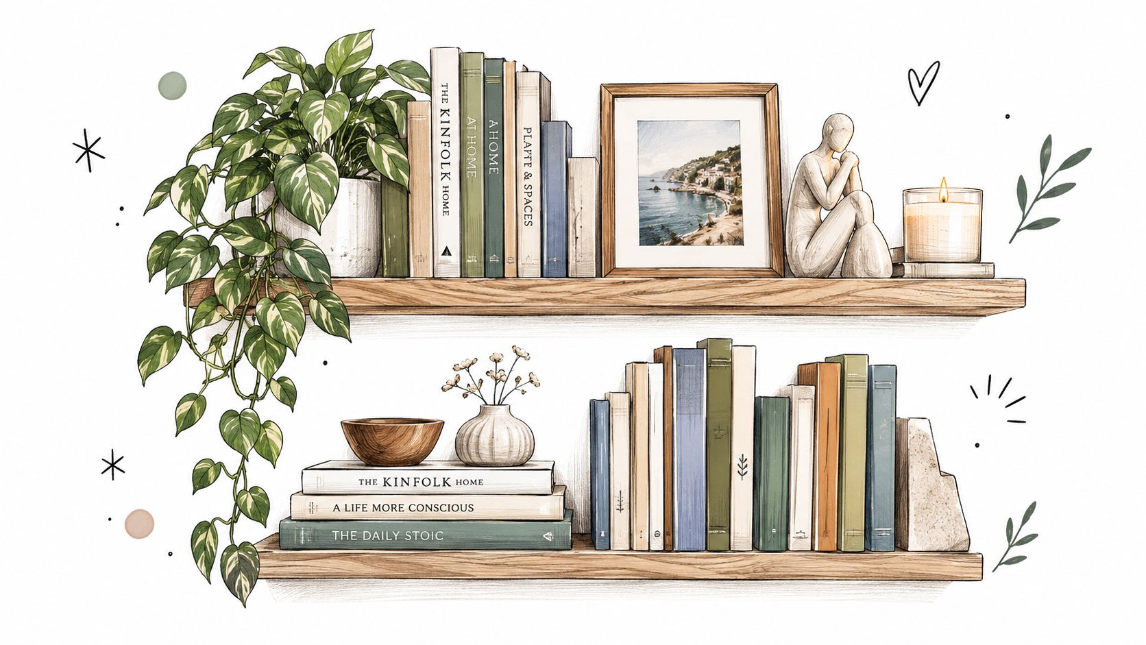
    A hand-drawn illustration of two floating wooden shelves decorated with potted plants, books, and decor items.

    Build depth without creating clutter

    Group related objects rather than scattering single items across every shelf. Vary height by placing a small object on a horizontal book stack, lean a frame against the back, or let a plant soften one edge. An office shelf should support concentration, while a bedside arrangement should feel quieter and less visually demanding.

    For artwork intended to shape an office atmosphere, you can browse these art prints for offices. Keep fragile or sharp objects away from children's reach and avoid placing candles where heat could damage books or finishes.

    Practical rule: Empty space isn't wasted space. It separates groupings so the display remains readable from across the room.

    3. The Minimalist Stack With Horizontal Books

    Horizontal stacks create visual pauses on shelves dominated by upright books. They also let you display attractive covers, support smaller objects, and use awkward low-height areas that won't comfortably fit a row of standing books. This arrangement suits a modern home office, a Scandinavian-inspired living room, or a bedroom where visual calm matters more than maximum capacity.

    Start with a few stable stacks rather than turning every book sideways. Place larger, heavier books lower on the unit and smaller books higher up, following the practical hierarchy recommended by Homes & Gardens' bookcase styling guidance. A small vase, framed photograph, or decorative object can sit on a stack when the books remain stable and the object doesn't make the pile difficult to use.

    Keep the stacks usable

    Stacking is attractive until the reader has to dismantle half the shelf to reach a frequently used title. Put occasional-use books in horizontal piles and keep daily reads upright or near the front of an accessible section. Bookends or dividers can prevent shifting, especially on a shelf near a frequently used chair or a busy hallway.

    A simple sequence helps:

    • Create varied heights: Use stacks of different sizes so the shelf doesn't become a flat series of identical blocks.
    • Protect stability: Keep piles aligned and avoid leaning books against unstable objects.
    • Show selected covers: Rotate the top book when you want a low-effort change in the display.
    • Preserve breathing room: Leave visible gaps between groups, but don't force identical spacing if the shelf proportions don't support it.

    This method offers calm and structure, but it sacrifices some storage efficiency. If you own a large collection, use horizontal stacks as accents within a primarily upright arrangement rather than making them the entire system.
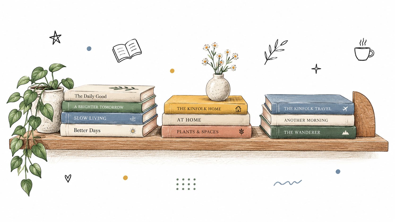
    A charming illustration of a wooden bookshelf featuring stacked books, a potted plant, and decorative floral elements.

    4. The Reading Nook Integration

    A bookshelf can solve more than a storage problem when it helps define a reading corner. Pair a tall bookcase with an upholstered chair, ottoman, side table, or bench, and the shelf becomes a backdrop for a space with a clear purpose. This is especially useful in open-plan North Georgia homes where a corner might otherwise feel unfinished.

    Place books at the eye level you naturally see while seated, with favorite or current titles easy to reach. A chair positioned near the shelf should allow comfortable movement without blocking cabinet doors, walkways, or lower storage. A side table can hold a current book, reading glasses, or a drink, while a floor lamp or wall-mounted light provides task illumination after daylight fades.

    Match scale, not just color

    A large bookcase behind a small chair can overwhelm the corner, while a narrow floating shelf above a substantial bench may look undersized. Compare the visual weight of the seating, shelf, lamp, and nearby rug. Upholstery can echo one color from the books without matching every spine.

    A bedroom corner might use a soft chair and a short shelf for a quiet retreat. A home office could place a tall unit behind a reading chair, creating a secondary zone without adding a partition. In a living room, a shelf behind an armchair can make an unused corner feel intentional.

    Keep the books you want to read within comfortable reach. A beautiful reading nook that requires you to cross the room for every book won't support the habit.

    The tradeoff is floor space. Seating makes the arrangement more useful, but it also increases the footprint and may not suit a narrow rental or a high-traffic family room. In smaller spaces, a wall-mounted shelf above a compact bench can provide the same visual cue with less obstruction.
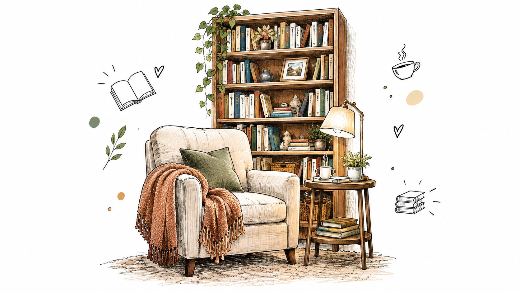
    A cozy reading nook featuring an armchair, a bookshelf, and a lamp in a warm sketch style.

    5. The Vintage and Eclectic Mix

    A vintage and eclectic shelf works when a room feels too anonymous or overly coordinated. Leather-bound books, old maps, antique boxes, travel souvenirs, writing tools, and collected art can give the display a personal history. The arrangement doesn't need a single color scheme, but it does need relationships between objects so it feels collected rather than accidental.

    Choose one or two anchor pieces first. A vintage globe might establish a travel theme in a living room, while an antique writing box could anchor a creative home office. Build around those pieces with books and smaller objects that share an era, material, subject, or personal connection.

    Give variety a quiet structure

    Group similar stories together. Travel books can sit with maps and souvenirs, while vintage photography can share a shelf with older art books. Use horizontal stacks to change height, and place smaller objects in trays or wooden boxes so they don't spread into visual noise.

    An eclectic arrangement benefits from pauses. Leave a little wall or shelf surface visible between collections, especially if the unit stands against a dark wall or near patterned furniture. Plants or fresh flowers can add a living element, but choose containers that don't compete with fragile antiques.

    This approach is ideal for a home library or character-rich living room, yet it can feel crowded quickly. Avoid treating every keepsake as a focal point. Select objects that invite discovery, then store the rest elsewhere so the display has room to breathe.

    6. The Symmetrical Arrangement With Anchor Pieces

    Symmetry can calm a room with awkward proportions, mismatched furniture, or several competing focal points. Matching bookends, paired objects, or a central artwork can create a visual center that makes a bookshelf feel deliberate. The method suits traditional and transitional rooms, but a near-symmetrical arrangement can also bring order to a contemporary office.

    Start with visual weight rather than item count. Two small objects may not balance one substantial sculpture, even if they occupy similar shelf areas. Place the anchor at the center or use matching anchors at the ends, then arrange books and objects so both sides feel comparable without requiring identical contents.

    Use near-symmetry in lived-in rooms

    Strict duplication can make a shelf feel staged. Try similar heights, materials, or colors with small differences in the books or personal objects. A home office might center framed artwork on one level and balance reference books on both sides. Bedside shelving can use matching bookends while allowing each side to reflect the person who uses it.

    For an example of how bookends can combine function and decorative character, see this bookend guide. Choose supports that hold books securely and suit the shelf's material, whether that means wood, metal, or another finish.

    Stand several feet away and check the arrangement from the doorway or sofa, not only from directly in front of the bookcase. Symmetry that looks precise up close can appear lopsided from the room's main sight line if one side carries darker colors or larger objects.

    7. Themed Collections by Subject or Interest

    Themed sections solve an everyday access problem. When travel books, cookbooks, children's classics, art books, and professional resources have clear zones, you can find what you need without sacrificing the shelf's visual character. The categories also turn the unit into a series of small stories instead of one uninterrupted block.

    Choose a manageable set of themes. A kitchen shelf might combine cookbooks, recipe cards, food artwork, and a vintage utensil. A home office could separate professional development, industry resources, and creative inspiration. A living room travel section might include guidebooks, maps, photographs, and souvenirs from places you've visited.

    Let each section do useful work

    Keep frequently referenced books at a comfortable height. Use bookends, dividers, or a meaningful object to mark the change between subjects. If visitors won't immediately understand the categories, a small label can help, but the books and objects should still feel natural without signage.

    Avoid creating so many categories that each group contains only a few isolated books. A themed area should feel intentional and substantial, not like a filing system broken into tiny fragments. For families, lower shelves can hold children's books by reading stage or interest, while fragile objects stay higher and out of reach.

    Rotate one or two related objects when the season or household interest changes. A gardening section can gain a small botanical print in spring, while a winter reading area might emphasize scenic photography and warm textiles. The books remain useful, and the display changes without requiring a new collection.

    8. Open Shelving for a Bedroom or Bathroom Retreat

    Bedrooms and bathrooms often benefit from shelves that feel lighter and calmer than storage-heavy units. Interspersing wellness, nature, art, or design books with folded linens, plants, smooth stones, and restrained decorative pieces can create a retreat-like mood. The approach addresses a room that feels purely functional, but it requires careful material choices.

    Use a quiet palette such as cream, soft gray, muted earth tones, and natural wood. In a bedroom, combine a small group of books with a plant, a framed print, or a soft textile. In a bathroom, rolled towels can add texture, but keep books and paper items away from direct splashes, steam, and areas where water may collect.

    Treat moisture as a design constraint

    Bathrooms can damage moisture-sensitive books, photographs, untreated wood, and some decorative finishes. Keep valuable or irreplaceable pieces in a drier room, and use the bathroom shelf for items that can tolerate the environment. Avoid open flames near towels, paper, and toiletries, and don't block ventilation or outlets with decorative objects.

    A guest bedroom may use calming books, soft lighting, and a few welcoming objects. A primary bedroom can keep the shelf intentionally sparse so it doesn't compete with sleep. The tradeoff is storage capacity. This style favors atmosphere over maximum book count, so it works best when the display holds selected titles and practical linens rather than the entire household library.

    In a bathroom, durability and moisture safety come before styling. A shelf should look peaceful without putting vulnerable books or objects at risk.

    Comparison of 8 Bookshelf Styling Ideas

    Style Implementation complexity Resource requirements Expected outcomes Ideal use cases Key advantages
    The Curated Mix: Combining Books by Color and Spine Design Medium, initial sorting and periodic updates Mostly existing books; time to sort; neutral-spined breaks optional Visually cohesive, gallery-like color flow Open shelving in living rooms, bedrooms, home offices Strong visual impact; encourages browsing; cohesive aesthetic
    The Layered Look: Mixing Books with Decorative Objects and Art Medium–High, thoughtful composition and updates Decorative objects, artwork, plants, lighting; more styling time Rich, personalized layered display with depth Bedrooms, living rooms, home offices that showcase personality Highly personal; dynamic variety; easy seasonal refresh
    The Minimalist Stack: Strategic Horizontal Book Arrangements Low–Medium, simple to implement but needs upkeep Few books per stack, bookends/dividers, tidy shelves Calm, organized minimalist look; covers featured Small spaces, reading nooks, Scandinavian or contemporary interiors Reduces visual clutter; easy access; highlights covers
    The Reading Nook Integration: Bookshelves as Part of a Functional Seating Display High, requires furniture coordination and layout planning Seating, side table, task lighting, coordinated shelving, space Functional, inviting focal reading zone that encourages use Bedrooms, living rooms, home offices with a spare corner Encourages reading; combines storage and seating; cozy focal point
    The Vintage and Eclectic Mix: Incorporating Books with Antiques and Collectibles Medium–High, curatorial skill to avoid clutter Vintage/antique items, collectibles, careful maintenance Story-driven, characterful, conversational display Home libraries, eclectic living rooms, creative home offices Unique personality; conversation pieces; sustainable reuse
    The Symmetrical Arrangement: Balanced Shelving with Anchor Pieces Medium, requires matching pieces and balance checks Matching bookends/anchor objects, consistent spacing Orderly, formal, harmonious shelving Traditional or transitional living rooms, offices, bedside tables Calm, easy-to-maintain symmetry; intentional sophistication
    The Themed Collections: Organizing Shelves by Subject or Interest Medium, requires categorization and periodic maintenance Related objects, labels/dividers, sufficient themed books Narrative mini-sections that simplify discovery Kitchens (cookbooks), home offices, living rooms with hobbies Functional organization; highlights passions; encourages browsing
    The Open Shelving Display: Creating Bedroom and Bathroom Spa-Like Atmospheres Medium, curated selection and regular upkeep Spa-like objects (towels, diffusers, candles, plants), few books Tranquil, retreat-like atmosphere prioritizing wellness Primary bedrooms, guest rooms, master bathrooms Promotes relaxation; minimalist calming aesthetic; multi-sensory appeal

    Make the Arrangement Easy to Live With

    A styled shelf should support the way your household moves through the room. Before you buy accessories or move furniture, test the existing unit with the books and objects you already own. A shelf that looks balanced in a close-up photograph may feel too dark, too tall, or too crowded when viewed from the entry, sofa, bed, or kitchen sight line.

    Use this checklist before calling the arrangement finished:

    • Measure the shelf: Check depth, internal height, overall width, and clearance around doors, windows, outlets, and walking paths.
    • Clean the surface: Remove everything, dust the shelves, and inspect for loose hardware or unstable brackets.
    • Protect daily access: Keep current reads, reference books, children's favorites, and frequently used items within easy reach.
    • Vary orientation: Combine upright rows with horizontal stacks to interrupt repetitive lines.
    • Balance visual weight: Distribute dark colors, large books, plants, and dense objects instead of concentrating them on one side.
    • Reserve empty space: Use breathing room to separate groupings and prevent the shelf from reading as a solid block.
    • Secure unstable pieces: Use proper bookends or shelf supports, and keep fragile objects away from children, pets, and busy walkways.
    • Check the main sight line: Step back and view the shelf from where people sit, enter, or work.

    Mistakes that make shelves harder to use

    Overcrowding is the most common problem. Adding one more object can hide the book behind it, make dusting difficult, and turn intentional groupings into visual noise. If the shelf feels heavy, remove items before rearranging everything.

    All objects at one height create a rigid band, while ignoring scale can make a small shelf look overwhelmed by oversized art or a tall bookcase look underfilled. Blocking light, outlets, vents, or access to nearby furniture also creates a practical problem that decoration can't solve. Symmetry shouldn't be forced when the shelf, wall, or furniture isn't symmetrical. Let visual weight guide the arrangement instead of duplicating objects mechanically.

    In bathrooms, don't use moisture-sensitive books, photographs, untreated wood, or fragile materials without considering steam and splashes. A guest bath may be better served by durable accessories and rolled linens than by a valuable collection.

    Refresh the display without replacing it

    Seasonal updates can stay simple. Change a few book jackets, exchange heavy throws for lighter textiles, add branches or a small plant, or rotate a framed print and a few display objects. In cooler months, warm wood tones and textured fabrics can make a reading corner feel inviting. During brighter seasons, lighter covers, green foliage, and more visible wall space can keep the arrangement airy.

    You don't need to restyle every shelf at once. Photograph the arrangement you like, keep a few objects in storage, and swap only what changes the room's mood. The most useful bookshelf styling ideas are the ones you can maintain while still finding your books, cleaning the surface, and living normally around the furniture.

    Woodstock Furniture & Mattress Outlet can help you compare furniture proportions, storage pieces, seating, and décor in person when you're deciding how a bookshelf will relate to the rest of a room. Its Room Planner tools and design resources can also help you think through placement before making changes, while an in-store visit lets you judge scale and finish in a real setting.


    Woodstock Furniture & Mattress Outlet offers furniture, mattresses, storage, seating, and décor for rooms that need to work as well as look finished. Visit Woodstock Furniture & Mattress Outlet to compare proportions and room pieces in person, and bring your shelf measurements so the guidance can stay practical.
  • 8 Brown Bathroom Ideas for a Warm, Modern Home

    8 Brown Bathroom Ideas for a Warm, Modern Home

    Could brown be the color that makes your bathroom feel warmer, calmer, and more finished without locking you into a style that dates fast?

    It often can. Brown is one of the most flexible color families in bathroom design because it covers a wide range of looks. Taupe can feel soft and quiet. Walnut can read refined and classic. Mocha can add depth. Stone-based browns often bring in the grounded feel many North Georgia homeowners want, especially in homes with limited natural light, wooded views, or more traditional architecture.

    The part that confuses people is that "brown" is not one decision. It is a set of smaller choices. Shade, undertone, texture, lighting, and the amount you use all change the result. A brown bathroom can feel airy like a spa or rich like a boutique hotel. The difference usually comes down to balance, much like choosing the right wood stain for a floor. The color family may stay the same, but the finish and surrounding materials decide whether it feels fresh or heavy.

    That is why this guide is built as a planning tool, not just a gallery of pretty rooms. Each idea focuses on a specific design problem to solve, such as how to keep brown from feeling dark, what materials pair well with it, where storage should work harder, and when a budget-friendly finish can give you the same effect as a premium one. If you want a broader starting point for palettes before narrowing in on brown, these curated bathroom colour design ideas can help you compare direction and mood.

    Before picking tile or paint, it helps to test the room itself. online bathroom planning lets you check layout, sightlines, and fixture placement first, so your color choices fit the bathroom you have. That matters in North Georgia, where an older hall bath in Canton, a brighter primary bath in Woodstock, and a cabin-style guest bath farther north may all need a different brown strategy.

    1. Warm Brown and Cream Neutral Foundation

    If you want brown to feel easy, start with cream.

    A warm brown and cream palette is one of the most forgiving brown bathroom ideas because it gives you contrast without harshness. The brown adds depth. The cream keeps the room open and calm. Together, they create a backdrop that works with traditional vanities, simple tile, or more furniture-like pieces.

    When brown tile is part of the plan, pairing it with cream, ivory, or taupe on nearby walls is a common design move because it balances the weight of the tile and keeps the room feeling open and spa-like, as noted in Edward Martin's guide to working with brown bathroom tiles. That's especially useful in North Georgia homes where bathrooms may have limited natural light or older layouts.

    How to Keep It From Feeling Heavy

    A warm tan wall with a cream vanity top often feels lighter than a dark brown wall with dark cabinetry. The mix matters more than the label on the paint chip. In a hall bath, for example, soft beige-brown walls with cream trim and a white sink can feel relaxed instead of muddy.

    Practical rule: Keep the ceiling and trim light when the walls lean medium or dark brown.

    This is also a good setup if you're unsure about undertones. Warm browns can shift throughout the day, so test samples beside your tile, countertop, and lighting. Morning light may make one shade look sandy, while evening light can pull it red or gray.

    A Good Real-World Version

    Try this combination in a guest bath:

    • Walls: Warm taupe or mocha paint in a matte finish
    • Countertop: Cream quartz or cream-toned stone look surface
    • Vanity: Natural oak or medium walnut
    • Hardware: Bronze or brushed nickel
    • Trim: Soft white

    If you'd like more ideas on coordinating warm neutrals, curated bathroom colour design ideas can help you compare similar palettes before you commit.

    2. Brown and White Subway Tile Contrast

    Subway tile keeps brown from taking over the room.

    That simple contrast is why this idea works so well. Brown tile on the lower wall or as a shower accent gives the bathroom warmth and identity, while white subway tile above it keeps the look familiar and clean. If you like classic bathrooms but don't want them to feel cold, this is one of the most practical brown bathroom ideas to consider.

    A stylish bathroom interior design sketch featuring brown subway tiles, a modern sink, and gold hardware fixtures.

    A farmhouse guest bath might use chocolate subway tile as wainscoting with white tile above. A more contemporary version might use warm tan subway tile in the shower niche or vanity backsplash while the rest of the walls stay bright.

    Small Decisions That Matter

    The transition height changes the whole look. If the brown tile stops too low, it can feel accidental. If it cuts at a natural visual line, often near vanity height or slightly higher, the room looks more intentional.

    Grout deserves more thought than people give it. Darker or tone-on-tone grout usually hides everyday wear better than bright white grout, especially around splash zones and lower walls.

    • For family bathrooms: Choose grout that won't show every mark.
    • For smaller bathrooms: Let white take up more wall space than brown.
    • For traditional homes: Stack the subway tile in a classic layout and keep fixtures simple.

    White and brown don't compete. They balance each other.

    This style also works well if you're remodeling in phases. You can tile one area now, then update paint, mirrors, and lighting later without reworking the whole room.

    3. Natural Brown Stone and Tile Finishes

    Brown gets more interesting when it isn't perfectly uniform.

    Natural stone and stone-look surfaces bring variation that flat paint can't. Travertine, slate, limestone-look porcelain, and other earthy tiles add movement through veining, texture, and small shifts in tone. That variation helps brown feel organic instead of flat.

    A luxurious modern bathroom featuring a white soaking tub against a textured travertine stone wall with natural light.

    In a primary bath, a travertine-look wall behind a soaking tub can create a quiet focal point. In a smaller powder room, even one stone-look backsplash or floor tile can do the job without overwhelming the room.

    Budget Versus Premium

    Real stone has a distinctive look and feel, but it asks more from you. It needs sealing, thoughtful cleaning, and careful use in wet areas. Porcelain and engineered surfaces usually ask less while still giving you much of the same visual warmth.

    For many North Georgia households, that tradeoff matters more than the prestige of the material. If kids share the bathroom or guests use it often, easier maintenance may be the better choice.

    • Premium route: Natural travertine or slate with a honed or brushed finish
    • Lower-maintenance route: Porcelain tile with stone veining and matte texture
    • Safer shower floors: Tumbled, brushed, or smaller-format tile with more grip

    Stone looks warm because it carries several browns at once, not just one.

    If you choose a strong stone pattern, let the other finishes stay quieter. Simple mirrors, plain wall color, and restrained hardware usually work better than trying to add another dramatic surface.

    4. Brown Wood Cabinetry and Vanity Foundation

    What if the easiest way to bring brown into a bathroom is not on the walls at all, but in the piece you use every day?

    A wood vanity often does the heavy lifting. It gives the room a warm center, much like a dining table grounds a kitchen eating area. That makes brown feel intentional instead of scattered. Walnut reads richer and more modern, oak feels lighter and more relaxed, and cherry-toned finishes add a more traditional note.

    This approach solves a common problem in North Georgia bathrooms. Many homes have bathrooms with limited natural light, and full brown walls can make those rooms feel smaller. A brown vanity keeps the warmth at eye level and below, while the surrounding walls, counters, and mirrors can stay light enough to bounce light back into the room.

    The vanity is also where function and style meet. You are choosing storage, sink space, countertop material, and daily durability all at once. That is why this idea works well as a planning framework, not just a look. If your current bathroom feels cold, cluttered, or too plain, the right cabinet style can address all three.

    How to Choose the Right Wood Vanity

    Start with the size and layout of the room. In a tight hall bath, a floating vanity or furniture-style base with visible floor underneath usually feels less bulky. In a primary bath, a wider double vanity can make the room feel balanced and give each user a defined zone.

    Then look at undertones. This is the part many homeowners second-guess. A vanity stain does not need to match the floor exactly, but the warmth level should make sense together. If the floor tile has gray-beige or taupe notes, a very red cherry finish may look out of place. If the floor leans warm, medium oak or walnut usually blends more naturally.

    Moisture resistance matters too. Bathroom cabinetry needs sealed finishes, stable construction, and hardware that holds up to frequent use.

    • Budget option: Stock oak or maple vanity with a medium stain and quartz top
    • Premium option: White oak or walnut vanity with dovetail drawers, soft-close hardware, and a furniture-grade finish
    • For small bathrooms: Choose drawers over deep cabinets if you want easier everyday storage
    • For family bathrooms: A quartz countertop is usually easier to maintain than marble or softer stone
    • For better lighting: Pair brown cabinetry with a white or cream counter and good mirror lighting so the vanity area does not read too dark

    If you want examples of layouts, sink configurations, and storage ideas before choosing a style, Trademaster Construction bathroom remodeling offers useful vanity-focused inspiration.

    One more practical tip. Brown wood looks best when nearby finishes give it room to stand out. A simple backsplash, quiet wall color, and mirrors with clean lines usually work better than competing with heavy grain, busy counters, and ornate lighting all at once.

    5. Brown Patterned Tile and Geometric Design

    Solid brown can feel calm. Patterned brown can feel alive.

    This approach works when you like the warmth of brown but want more movement, contrast, or personality. Geometric tile, Moroccan-inspired motifs, mosaics, and mixed-tone surfaces can turn brown into a feature instead of just a background color.

    A shower wall in a brown and cream geometric tile can bring energy to an otherwise simple bathroom. A powder room floor with a repeating brown pattern can add character without demanding a full remodel. Pattern is especially useful when the room lacks architectural detail.

    Where Pattern Helps Most

    Use it where the eye naturally lands. Behind the vanity, inside a shower surround, or underfoot in a powder room are all smart places. Covering every wall with a patterned tile often makes a small bathroom feel busy.

    This is also the section where scale matters. A large-format pattern may feel calm in a spacious primary bath but oversized in a narrow guest bath. Smaller repeated patterns usually behave better in tighter rooms.

    • For a bold focal point: Put the patterned tile on one wall only
    • For balance: Keep nearby walls plain and fixtures simple
    • For installation: Hire someone who's comfortable laying out repeating patterns cleanly

    If you're gathering ideas for vanity walls and accent surfaces, Trademaster Construction bathroom remodeling offers useful visual comparisons for feature-area planning.

    The busier the tile, the simpler the rest of the room should be.

    A practical example would be a cream bathroom with one brown patterned shower wall, plain bronze hardware, and a solid wood vanity. You still get personality, but the room stays readable.

    6. Brown and Brass or Bronze Metal Fixture Pairing

    Brown rarely looks finished until the metal is right.

    Warm metals like brass, bronze, and oil-rubbed bronze usually sit naturally beside brown because they share some of the same visual warmth. Instead of fighting the palette, they deepen it. That's why this pairing shows up so often in bathrooms that aim for a refined, hotel-like feel.

    A medium-brown vanity with brushed brass pulls can feel modern and polished. A tan tile bathroom with oil-rubbed bronze faucets can feel more classic. Both work, but they create different moods.

    Keep the Finish Story Consistent

    Mixing too many metal tones can make a warm bathroom feel unsettled. If the faucet is brushed brass, the mirror frame, sconces, and hardware should usually stay in that same family or at least not clash with it.

    The color of the light matters too. Warm lighting tends to flatter both brown surfaces and warm metals. Cooler bulbs can make the room feel sharper and less cohesive.

    Design guidance also recommends restraint with the brown palette itself. The practical "Rule of 3" suggests limiting the room to no more than three distinct brown shades so the space stays calm rather than visually crowded, as explained in Sanctuary Bathrooms' brown color ideas inspiration.

    A Reliable Pairing Formula

    • Light brown walls: Pair with brushed brass for a softer upscale look
    • Medium wood vanity: Pair with bronze for a grounded, classic feel
    • Dark chocolate tile: Pair with simpler metal shapes so the room doesn't feel too formal

    Order or borrow finish samples when you can. Brass can read yellow, muted, antique, or almost champagne depending on the brand and lighting. Brown shifts too, so the combination should be tested together, not chosen separately.

    7. Brown Accent Wall with Neutral Surrounding Surfaces

    What if you want the warmth of brown without making a small bathroom feel closed in?

    An accent wall solves that problem. It gives you one place to bring in depth and character while the surrounding walls, floor, or vanity keep the room bright. In design terms, it works like a visual anchor. Your eye lands there first, so the space feels intentional instead of scattered.

    This approach is especially useful in North Georgia homes where guest baths and older primary bathrooms can have limited natural light. A full room of medium or dark brown may feel heavier than expected. One brown focal wall usually gives you the mood people want from brown, but with less risk and more flexibility if you update the room later.

    Why an Accent Wall Works

    Brown has visual weight. That is not a bad thing. It just means the color tends to feel stronger and more grounding than white, cream, or pale gray.

    Using that weight on one surface is often easier to control. The neutral surfaces around it reflect more light, make cleaning details easier to see, and keep the room from feeling overly dark. If you are unsure how much brown your bathroom can handle, this is often the safest testing ground.

    Where to Place It

    The best accent wall is usually the one the room already wants to highlight.

    • Behind the vanity: Good for creating a strong focal point around the mirror and sconces
    • Behind the tub: Helpful when a plain wall needs more presence
    • Inside the shower or on the back shower wall: Adds depth, especially with tile, without changing the whole room

    If the room is narrow, placing the brown on the far wall can also make the layout feel more balanced. If the ceiling is low, keep the side walls light so the room does not feel compressed.

    Best Material Choices by Budget

    Paint is the easiest budget option. A warm cocoa, taupe-brown, or mushroom-brown wall behind the vanity can change the room quickly.

    Tile is the more durable upgrade, especially for shower areas. Porcelain in matte brown, walnut-look tile, or a stacked vertical tile in coffee tones gives texture as well as color. For a premium version, wood-look porcelain slabs or natural stone in brown and cream can create a custom feel while still tying into neutral surfaces.

    Wallpaper can work too, but choose it carefully. In a bathroom, subtle pattern usually ages better than a busy print.

    How to Keep It Balanced

    The surrounding finishes do most of the balancing work. White quartz counters, soft cream paint, light greige tile, and simple mirrors help the brown wall stand out without making the room busy.

    Storage matters here too. If the accent wall sits behind an open vanity packed with products, the focal point gets lost. A recessed medicine cabinet, closed vanity storage, or floating shelves with just a few organized items will keep the wall readable. Good lighting matters just as much. Warm white bulbs help brown look rich and grounded rather than flat or muddy.

    A simple rule helps. If the accent wall has strong color or texture, let the other surfaces stay quieter.

    That is what keeps the room polished.

    A Practical Planning Formula

    Use this framework if you are deciding whether an accent wall fits your bathroom:

    • Small, darker bathroom: Choose one medium brown wall and keep the other surfaces light
    • Average hall bath: Use paint for the accent wall and put the budget into better lighting and storage
    • Primary bath remodel: Use brown tile or stone on the focal wall, then balance it with neutral flooring and counters

    For homeowners who like brown but do not want to commit to it everywhere, this is often the smartest middle ground. You get warmth, contrast, and a clear focal point without asking every surface in the room to do the same job.

    8. Brown Textiles and Accessories Layering

    If permanent brown still feels like a big commitment, start with fabric and accessories.

    This is one of the easiest brown bathroom ideas for renters, first-time decorators, or anyone refreshing a bathroom on a tighter budget. Brown towels, bath mats, shower curtains, baskets, and even artwork can warm up a plain white or cream bathroom fast, without tile work or paint.

    A neutral apartment bathroom with white walls and a simple vanity can feel more settled with camel towels, a cocoa bath mat, and a linen shower curtain in a warm taupe. In a family home, those same changes can help test whether brown feels right before you invest in larger materials.

    How to Make Accessories Look Intentional

    The mistake people make is choosing one flat brown and repeating it everywhere. Better results usually come from layering a few related tones. Think sand, mushroom, walnut, and chocolate in different proportions.

    This approach also solves a real problem in resale prep. Brown bathrooms often get discussed in terms of color alone, but staging matters too. Guidance on brown bathroom decorating notes a gap in practical resale-specific advice, especially around using lighting, warm-toned textiles, and neutral-framed mirrors to make brown bathrooms feel brighter and more current, as discussed in Tip Top Furniture's brown bathroom decorating ideas.

    Soft goods can modernize a bathroom faster than many people expect.

    A Simple Layering Formula

    • Large item: One solid shower curtain or bath mat in a warm medium brown
    • Support pieces: Towels in lighter and darker related tones
    • Finishing touches: Wood tray, woven basket, or simple framed mirror

    If you're already updating nearby spaces, Woodstock Furniture & Mattress Outlet carries home décor items that can coordinate with brown bathroom textiles, which makes it easier to create a connected look from bath to bedroom or hallway.

    8-Point Comparison: Brown Bathroom Ideas

    Item Implementation complexity Resource requirements Expected outcomes Ideal use cases Key advantages
    Warm Brown and Cream Neutral Foundation Moderate, paint/tile/cabinet options, sample testing Low–Medium, paint or tile, possible lighting upgrades Cohesive, calming backdrop; versatile tone Whole-room schemes, spa-like bathrooms, flexible styles Timeless, hides minor stains, pairs with many finishes
    Brown and White Subway Tile Contrast Medium–High, precise tile work and grout choices Medium, tiles, grout, likely pro installation Clean, classic contrast; bright upper area, grounded lower Wainscoting, accent walls, traditional or contemporary baths Affordable, easy to clean, replaceable tiles
    Natural Brown Stone and Tile Finishes High, stone selection, sealing, specialist install High, costly materials, sealing, maintenance Luxurious, textured, unique natural appearance High-end renovations, spa bathrooms, feature floors/walls High-end aesthetic, durable when sealed, unique veining
    Brown Wood Cabinetry and Vanity Foundation Medium, cabinet selection, fit, moisture protection Medium–High, quality wood, finishes, proper ventilation Furniture-like focal point with ample storage Renovations needing storage, focal vanities, residential feel Anchors design, ages well, flexible with countertops/tiles
    Brown Patterned Tile and Geometric Design High, pattern planning, precise alignment, skilled installer Medium–High, specialty tiles, potential higher labor Dynamic, personality-rich surfaces that draw attention Feature walls, shower surrounds, eclectic or contemporary spaces Adds visual interest, masks marks, multi-tone depth
    Brown and Brass or Bronze Metal Fixture Pairing Low–Medium, selecting matching finishes, standard install Medium, higher-cost fixtures, order samples Cohesive warm aesthetic; curated, upscale finishings Final accents in renovations, cohesive metal palettes Warmer than chrome, hides spots, develops attractive patina
    Brown Accent Wall with Neutral Surrounding Surfaces Low, single-wall paint/tile or wallpaper Low–Medium, material for one wall only Focused statement without overwhelming space Small bathrooms, renters, incremental updates Flexible, less permanent, maintains sense of openness
    Brown Textiles and Accessories Layering Very low, purchasing and arranging textiles Low, towels, mats, shower curtains, seasonal updates Subtle warmth and depth; easy to refresh Renters, budget updates, testing color direction Non-permanent, inexpensive, highly flexible and seasonal

    Find Your Perfect Shade of Brown in North Georgia

    Which brown fits your bathroom, your light, and your home in North Georgia?

    The answer usually starts with the problem you are trying to solve. If the room feels cold, a warm taupe, mushroom, or walnut tone can add comfort. If it feels busy, a quieter brown with creamy undertones can settle it down. If the room already has a lot of visual weight from dark floors or cabinets, a lighter sandy brown often works better than a deep espresso.

    Brown works like wood stain selection. Two shades can look similar on a sample card and behave very differently once light hits them. A north-facing bathroom may make brown read cooler and flatter, while a bathroom with strong natural light can handle richer tones without feeling closed in. That is why testing the color next to your tile, countertop, and vanity finish matters more than choosing it in isolation.

    For many homeowners here, the best plan is to match the shade of brown to both the house style and the level of commitment you want. Newer suburban homes often look best with soft browns mixed with white, cream, or brushed metal finishes. Cabin-inspired or traditional homes can carry deeper wood tones, stone, and warmer bronze accents. In a small powder room, one brown feature such as a vanity or accent wall may be enough. In a larger primary bath, you may have room for layered browns through cabinetry, tile, and textiles.

    Budget matters too, and brown gives you more than one path. If you want a lower-cost update, paint, towels, a mirror frame, and a wood-toned vanity can shift the room quickly. If you are planning a longer-term remodel, tile, stone-look porcelain, quality wood cabinetry, and improved lighting give you a more finished result. The smartest choice is not always the most expensive one. It is the one that solves the room's weak spot first.

    Lighting is often that weak spot.

    Brown tends to look best with enough layered light to keep shadows from collecting in corners. A bathroom with overhead lighting only can make warm finishes look muddy. Adding vanity lighting at eye level, a brighter shower light, and a mirror that reflects natural light usually gives brown a cleaner, more intentional appearance. Storage plays a similar role. If counters stay cluttered, even a beautiful brown palette can feel heavy. Closed vanity storage, recessed niches, and a medicine cabinet help the color read as calm rather than crowded.

    North Georgia homes vary a lot, so there is no single correct shade. A compact hall bath may benefit from light oak, caramel, and cream. A primary suite with more square footage may support mocha cabinetry, stone-look tile, and brass or bronze fixtures. Older bathrooms that need a visual reset often respond well to one strong brown anchor, then lighter surrounding surfaces to keep the room open.

    If you'd like to see how different wood finishes and materials look in person, visit one of our North Georgia showrooms. Our experienced team is always here to help you pull your vision together.

    If you're comparing vanities, wood tones, mirrors, or coordinating décor for a bathroom refresh, Woodstock Furniture & Mattress Outlet is a helpful place to start. With North Georgia showrooms, knowledgeable staff, and a broad mix of home furnishings and accent pieces, the team can help you sort through real-world choices and find a look that fits your home, your layout, and your comfort level.