
Can a room feel natural because it contains wood, plants, or neutral colors? Not always. A space can include all three and still feel flat, cluttered, or difficult to maintain if the materials don't suit the way you live.
Successful natural home decor depends on more than appearance. It combines honest material choices, layered texture, suitable lighting, useful furniture, and enough open space for the room to breathe. A jute rug may add warmth, but it also needs thoughtful placement. A live plant can soften a corner, but only if the light and care requirements match your routine. Reclaimed wood can bring character, yet its condition and finish deserve inspection before it enters a busy family room.
The ten ideas below are a flexible framework, not a shopping checklist. You can adapt them with pieces you already own, second-hand finds, responsibly sourced materials, or furniture and décor explored through Woodstock Furniture & Mattress Outlet. Start with the room's biggest problem, then choose the natural element that solves it.
1. Wood Accents and Natural Wood Furniture
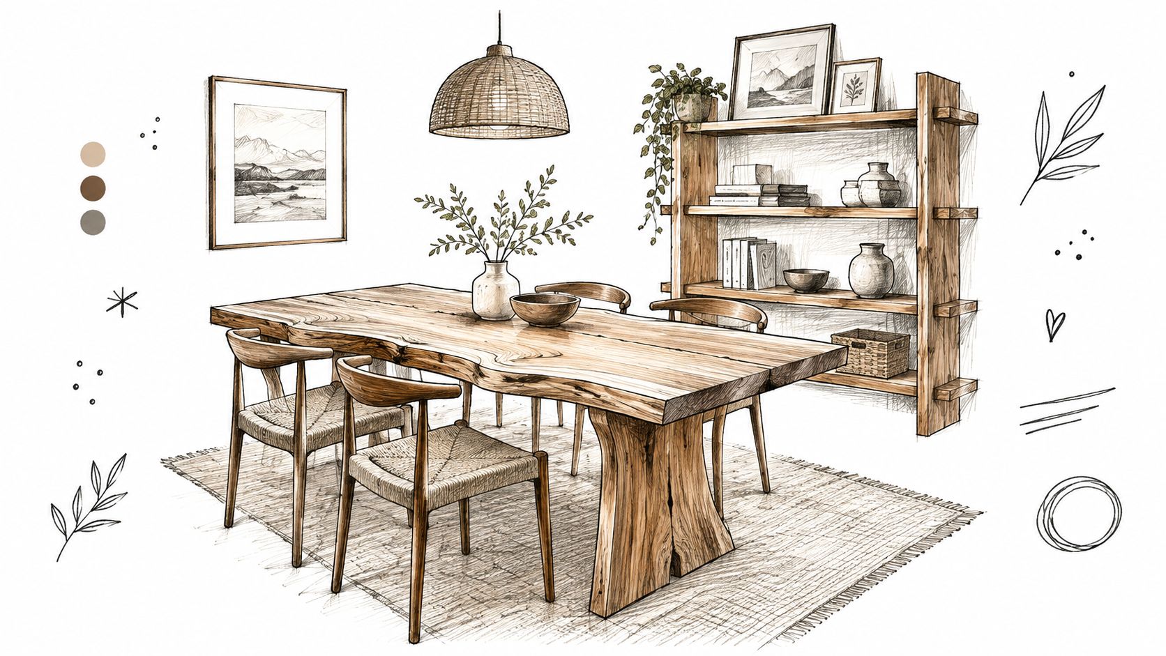
Could one wooden table make a room feel warmer without changing everything around it? Often, yes. A solid wood dining table can anchor a gathering area, while a natural-finish bed or dresser creates a calmer base for linen bedding. Smaller pieces, such as shelving, frames, boxes, or a live-edge console, add visible grain without crowding the room.
First decide whether wood will carry the room or support it. A large table or bed frame has substantial visual weight. Balance it with neutral upholstery, pale walls, or lighter textiles so the space does not feel heavy. A shelf has a smaller role, making it useful for displaying plants, ceramics, books, and personal objects.
Choose the source as carefully as the style
The material's origin and construction affect its environmental profile and everyday care. The sustainable interior design market is projected to grow from $388.7 billion in 2024 to $663.9 billion by 2034, an increase of about 71%, with a projected 5.5% CAGR, according to Global Insight Services' sustainable home decor market coverage. This category can include wood, bamboo, reclaimed wood, natural fibers, and lower-impact finishes.
Before buying, ask whether the piece is solid, veneered, reclaimed, or engineered. Check the finish as well, since it affects resistance to moisture, heat, scratches, and staining. In the United States, wood represented 44.44% of the home decor material market in 2025, while sustainable and reclaimed wood variants were projected to grow at a 10.29% CAGR through 2031, based on the same report coverage. Growing interest does not replace checking the source, condition, and construction of an individual item.
Practical rule: Mix wood tones deliberately. A lighter piece beside a deeper tone can create depth. Several unrelated finishes may make the room feel accidental.
Use coasters, wipe spills promptly, and follow the care instructions. Place wood carefully near kitchens, bathrooms, windows, and heating sources, where moisture, sunlight, or dry heat can change its appearance.
2. Indoor Plants and Living Greenery
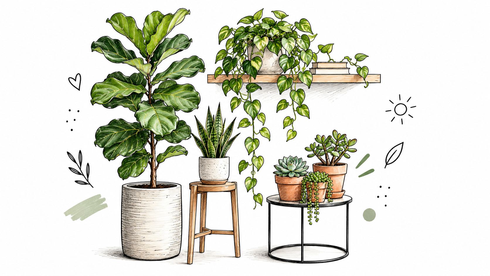
A plant changes over time, which is part of its appeal. Greenery can soften the hard outline of a sofa, fill an unused home-office corner, or add height beside a media console without introducing another rigid object. A tall snake plant can occupy vertical space, pothos can trail from a high shelf, and a small herb garden can make a kitchen windowsill both attractive and useful.
Start with the room rather than the plant. Observe the available light, temperature changes, airflow, and how often someone can water it. Pothos, snake plants, and ZZ plants are practical starting points for people who don't want an elaborate care routine, but every plant still needs conditions it can tolerate.
Create a plant grouping
Scattering single pots across every surface can make a room look busy. Instead, group plants in one corner using different heights, pot shapes, and leaf sizes. A wooden stand, floating shelf, or woven basket can create layers while keeping the arrangement contained.
In a living room, place a monstera beside the sofa as a focal point, then repeat a smaller green shape on a shelf. In a bedroom, use modest plants on a nightstand only if soil, moisture, and nighttime maintenance won't become irritating. Homes with children or pets also need a safety check, since some common houseplants can be harmful if eaten.
For more compact inspiration, explore cactus garden ideas at The Cactus.
Plants can support the feeling of a fresher interior, but don't treat them as a replacement for ventilation or air-quality controls. Choose attractive ceramic, terracotta, or woven pots, and use saucers or waterproof liners to protect furniture and flooring.
3. Stone and Natural Rock Elements
Stone gives a room visual weight. Slate, marble, granite, limestone, and river rock each bring a different combination of color, pattern, and texture, so the right choice depends on whether you want a quiet background or a strong focal point. A marble side table can sharpen a relaxed seating area, while a slate accent wall or stacked-stone fireplace surround creates a more permanent architectural statement.
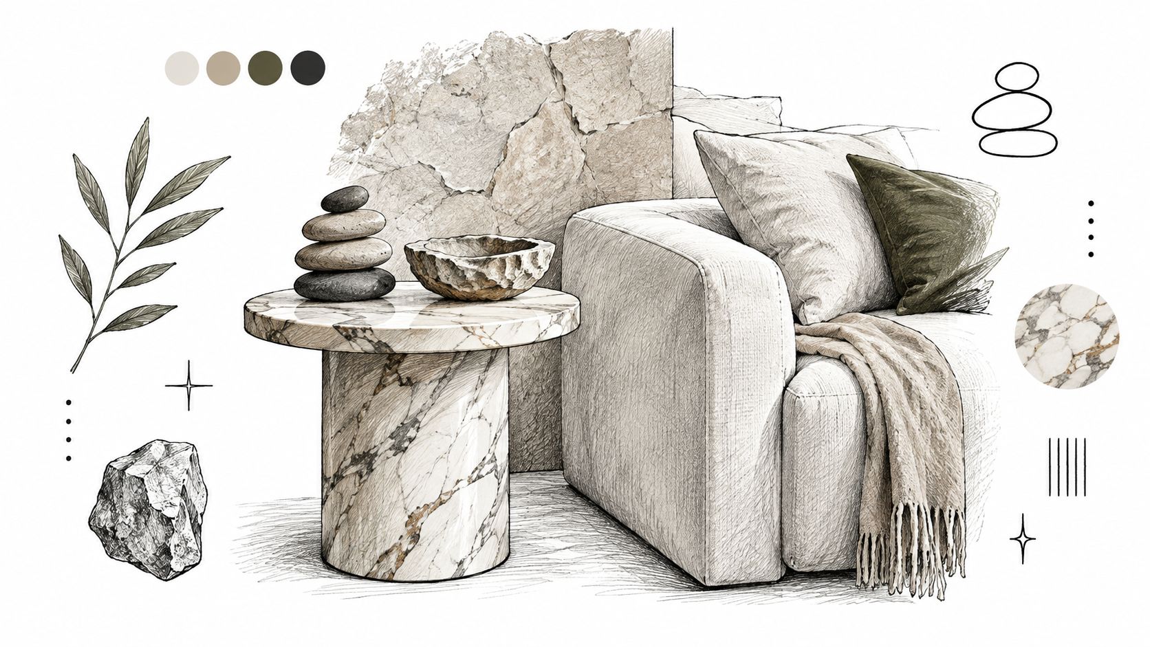
Smaller pieces are often easier to live with. Stone coasters, lamp bases, planters, and river rocks in a shallow bowl introduce the material without committing to a renovation. A marble or granite table beside a sofa can also pair naturally with wood, allowing the warm and cool surfaces to balance each other.
Balance permanence with comfort
Stone can feel cool, hard, and visually heavy, especially in a small room. Add wool throws, linen upholstery, woven baskets, or a wood frame to keep the setting inviting. Lighter stone can help a compact space feel less dense, while a darker slab may work better as one controlled accent.
Before buying a large stone piece, check its weight, dimensions, edge profile, and cleaning requirements. Porous surfaces may need specific care, and some finishes can react poorly to acidic cleaners. If you're considering translucent onyx, review onyx translucency and installation considerations before treating it as a simple decorative surface.
A stone coffee table also deserves a household-use test. Can children reach the edges? Will you place hot mugs on it? Does the room have enough circulation around its base? The material may look natural, but the safest choice still depends on the room's daily demands.
4. Natural Fiber Textiles and Woven Materials
Texture often makes a neutral room feel finished. Jute, sisal, linen, cotton, wool, and hemp can appear in rugs, upholstery, curtains, pillows, baskets, and wall hangings. Their varied surfaces give the eye something to notice even when the colors stay within cream, tan, gray, or muted green.
Try building the room around one substantial textile. A linen sofa can provide a relaxed foundation, while a jute rug defines the seating area. Add a cotton canvas curtain for filtered light and a wool throw for warmth. The combination works because each material feels different to the touch.
Match the textile to the household
A natural fiber isn't automatically the right choice for every high-traffic location. A loosely woven rug may catch claws, snag on furniture, or hold crumbs more visibly than a tighter construction. Linen upholstery can look relaxed and lived-in, but the specific weave, finish, removable-cover design, and cleaning instructions matter.
Use a short material check before committing:
- Traffic: Decide whether the piece will sit in a quiet bedroom, a busy hallway, or beneath a dining table.
- Spills: Check whether the textile is washable, spot-cleanable, or dependent on professional care.
- Texture: Avoid rough surfaces where bare feet, crawling children, or sensitive skin will come into frequent contact.
- Layering: Combine smooth linen with a chunky knit, woven pillow, or softer cotton instead of repeating one coarse texture.
A natural-fiber rug under a dining table needs enough room for chairs to move without catching an edge. In a family room, keep the most delicate textiles on accent chairs or decorative pillows, and choose more forgiving materials for the main seating.
5. Natural Light and Window Treatments
Natural light helps reveal the grain of wood, the variation in stone, and the weave of linen. It also changes throughout the day, so a room may need window treatments that control glare and privacy without turning the windows into a dark wall.
Sheer linen curtains can filter daylight while maintaining a softer view. Roman shades in a pale natural color can be raised during the day, and mirrors placed opposite windows can redirect light deeper into a room. Keep furniture from blocking the brightest light pools, particularly in smaller living rooms where one window may carry much of the room's visual energy.
Design around changing conditions
A bright south-facing room, a shaded north-facing room, and a bedroom requiring nighttime privacy won't use the same treatment. Test fabric samples near the window at different times, because a warm white can appear creamier under warm artificial bulbs and cooler in daylight.
Natural light should support the room, not dictate every decision. Privacy, glare control, furniture protection, and comfortable evening use still matter.
Clean glass and uncluttered sills can improve the sense of openness, while plants near a window can turn the light into a design feature. For bedrooms or street-facing rooms, pair sheers with a second layer that provides privacy after dark. The practical checkpoint is simple: raise, lower, open, and close the treatment as you would on an ordinary day. If the mechanism feels inconvenient, the room won't stay as open as the original styling plan.
6. Earthy Color Palettes and Neutral Tones
An earthy palette gives natural materials a consistent setting. Warm beige, soft brown, muted green, gentle gray, and warm white can work together without making every surface the same color. The key is variation in depth and texture, not a room filled with identical pale shades.
A living room might combine warm taupe walls, a beige sofa, and wood side tables. A bedroom could use soft gray, warm white, and natural wood, while a dining area might pair muted sage walls with brown chairs. These combinations keep the focus on material character rather than a loud accent color.
Prevent neutral from becoming flat
Use a light shade for the broadest surfaces, a middle tone for furniture, and a deeper earth color for small anchors such as a lamp, framed artwork, or occasional chair. Then vary the texture within the same family. A cream linen pillow beside a nubby wool throw and a woven basket will feel more layered than three smooth cream accessories.
Lighting changes color perception, so sample paint or fabric where it will sit. A warm bulb can intensify beige and brown, while daylight can make gray or green feel more pronounced. Existing flooring, countertops, and wood finishes should also influence the palette.
If the room already contains several wood tones, use wall color and textiles to connect them rather than forcing every piece to match. The result should feel collected, not manufactured as a single set.
7. Water Features and Natural Moisture Elements
Water introduces movement and sound, which can make a quiet corner feel intentional. A tabletop fountain on a living-room side table, a small zen fountain with stones in a home office, or water-inspired artwork in a meditation area can suggest calm without requiring a major installation.
Actual water features need more planning than a framed print. Place a fountain on a waterproof, stable surface and keep electrical connections away from splash zones. A side table that looks suitable may not have the weight capacity, surface protection, or location needed for repeated moisture.
Keep the feature proportionate
A large room can accommodate a more substantial feature, while a compact apartment may benefit from a small tabletop design or artwork that suggests water through blue-gray color and flowing shapes. The feature should support the room's existing focal point instead of competing with a fireplace, television, large window, or conversation area.
Check how the feature is cleaned, how often water must be replaced, and whether its sound suits the room. A gentle sound may be welcome near a reading chair but distracting beside a desk or sleeping area. Homes with young children or pets also need a stable placement that can't be easily tipped.
Moisture isn't a free indoor-air solution. Keep the surrounding area dry, watch for condensation, and avoid placing water near unfinished wood, absorbent textiles, or electronics.
8. Raw and Unfinished Surfaces
Raw brick, exposed beams, natural plaster, and minimally finished wood can give a room a sense of history. Their irregularities become the decoration, so you don't need to cover every wall with accessories. An exposed brick wall can anchor a living room, while a textured plaster finish can give a quiet entryway more depth.
These surfaces work best when the rest of the room provides comfort and control. Pair a rough wall with a supportive sofa, soft curtains, a wool throw, or a smooth wood table. Add directional lighting to reveal texture, but test the effect at night because strong shadows can make a surface feel harsher than it does in daylight.
Understand the cost of character
Unfinished doesn't mean maintenance-free. Raw wood can absorb marks, unsealed concrete can show spills, and brick or plaster may shed dust or require careful cleaning. A family room, home office, or rental-friendly accent wall may handle visible patina well, but a dining area with frequent spills may need a protective finish.
Indoor material choices also affect chemical exposure. The U.S. Environmental Protection Agency's formaldehyde guidance identifies pressed wood products made with urea-formaldehyde resins as a significant potential home source and recommends measures including exterior-grade pressed wood, ventilation, and humidity control. A peer-reviewed review of indoor materials also discusses aldehydes from wood-based panels and VOCs from furniture, finishes, glues, paints, and floor coverings.
The practical lesson is to ask what lies beneath the visible surface. Natural appearance, low-emitting construction, finish chemistry, and ventilation are separate questions.
9. Natural Scent and Aromatics
Scent can complete a natural atmosphere, but it should stay subtle enough for everyone in the home. Dried lavender in a bedroom, eucalyptus in a bathroom, fresh flowers in a ceramic vase, or a potted citrus plant can add sensory interest while contributing to the room's appearance.
An essential-oil diffuser belongs on a stable, protected surface, away from delicate wood and electronics. If you use a wooden diffuser, review care and oil options for wooden diffusers before choosing where to place it. Oils can mark some finishes, and water-based devices can create moisture around the base.
Use scent with restraint
Start with one aromatic source in a room. A living room may need only fresh branches or a mild diffuser, while a bathroom can handle eucalyptus because the room already has a clear ventilation routine. In a small bedroom, strong or layered fragrances may become uncomfortable rather than relaxing.
Fresh flowers, dried botanicals, and essential oils also require different maintenance. Replace water before it becomes stale, remove fading stems, dust dried arrangements, and ventilate small spaces. Households with allergies, asthma, pets, or scent sensitivities should choose unscented natural décor or use scent only occasionally.
Seasonal changes can keep the room interesting, but the safest approach is to adjust gradually. Fresh florals may suit spring, while dried herbs or subtle wood notes may feel appropriate in cooler months. Natural doesn't automatically mean universally harmless, so read labels and observe how people and pets respond.
10. Sustainable and Reclaimed Materials
Reclaimed wood, vintage furniture, salvage pieces, bamboo, cork, recycled glass, and upcycled materials can add character while reducing the pressure to replace every item with something new. A reclaimed dining table can become the room's story-bearing centerpiece, while a vintage cabinet or salvaged shelf can give an entryway useful storage.
Second-hand sourcing also changes the buying process. You need to inspect the piece instead of assuming that age equals quality. Look beneath tables, open drawers, test doors and hardware, check for odors or moisture damage, and assess whether the structure can handle current use.
Verify the story and the condition
Ask where reclaimed material came from, how it was treated, and what finish was applied. For new wood, look for meaningful sourcing information rather than relying on words such as “natural” or “eco.” A recent sustainability gap remains between products that look natural and products with verified lower-impact credentials. Industry coverage reports that 64% of global consumers consider environmental impact when buying home furnishings, compared with 47% in 2021, while certified sustainable home-decor products are estimated at 18% of SKUs at major retailers and FSC or reclaimed wood at about 22% of wood-based décor sold at major chains in 2025, according to House Digest's coverage of nature-inspired decor.
Those figures make verification more useful, not less. Ask for certification details, recycled content, repair history, and cleaning requirements. Bamboo, cork, hemp, cotton, jute, and reclaimed wood are often associated with sustainable décor, but environmental performance depends on processing, transport, durability, and end-of-life options.
A material's story matters, but its everyday service matters too. A well-cared-for piece that stays useful can be a more sensible choice than a fragile item purchased only for its appearance.
Natural Home Decor, 10-Item Comparison
| Item | Implementation complexity | Resource requirements | Expected outcomes | Ideal use cases | Key advantages |
|---|---|---|---|---|---|
| Wood Accents and Natural Wood Furniture | Moderate, selection, delivery, occasional refinishing | High, quality timber, craftsmanship, maintenance | Warmth, durable focal pieces with natural texture | Dining tables, bedroom sets, statement shelving | Timeless, durable, pairs well with other natural materials |
| Indoor Plants and Living Greenery | Low–Moderate, plant selection and ongoing care | Low, pots, soil, light; variable by plant size | Improved air quality, color, dynamic texture | Shelves, corners, home offices, bathrooms | Low cost, wellbeing benefits, highly flexible |
| Stone and Natural Rock Elements | High, heavy installation, possible structural work | High, material cost, specialized labor, sealing | Sophisticated, permanent focal points; tactile contrast | Fireplace surrounds, accent walls, side tables | Extremely durable, timeless, neutral coordination |
| Natural Fiber Textiles and Woven Materials | Low, purchase and placement; occasional care | Low–Moderate, fabric costs, laundering/care | Added warmth, tactile texture, breathable surfaces | Rugs, upholstery, throw pillows, curtains | Sustainable options, softens spaces, ages well |
| Natural Light and Window Treatments | Low–Moderate, treatment choice, possible glazing work | Low–High, simple sheers to skylights or large windows | Brighter, more spacious-feeling rooms; highlights materials | Living rooms, bedrooms, studios, sunlit corners | Energy savings, mood boost, showcases textures |
| Earthy Color Palettes and Neutral Tones | Low, paint and finishes selection | Low, paint and soft furnishings | Cohesive, calming backdrop that emphasizes materials | Whole-home schemes, living rooms, bedrooms, offices | Timeless, easy to coordinate, flexible for updates |
| Water Features and Natural Moisture Elements | Moderate–High, plumbing, electrical, placement | Moderate, feature cost, water/electric use, upkeep | Calming soundscape, increased humidity, dynamic focal point | Meditation rooms, entries, relaxation or spa areas | Sound masking, relaxation benefits, visual movement |
| Raw and Unfinished Surfaces | Low–Moderate, exposing or leaving surfaces untreated | Low–Moderate, repair/maintenance, possible sealing | Authentic, textured spaces that develop patina over time | Lofts, industrial interiors, feature walls, shelving | Honest materiality, low-chemical, gains character with age |
| Natural Scent and Aromatics | Low, diffusers, botanicals, fresh flowers | Low, oils, dried botanicals, plants | Multi-sensory ambiance; mood and perceived freshness | Bedrooms, bathrooms, living spaces, entryways | Inexpensive, decorative and therapeutic, seasonally adaptable |
| Sustainable and Reclaimed Materials | Moderate, sourcing, inspection, possible restoration | Variable, often lower material cost but time-intensive sourcing | Unique, storied pieces with reduced environmental impact | Statement furniture, rustic/eclectic designs, upcycled projects | Eco-friendly, one-of-a-kind character, supports local makers |
Build a Natural Look That Works for Your Home
Natural home decor works best when it solves a real room problem. If the living room feels cold, start with wood, wool, or warm lighting. If the bedroom feels visually busy, reduce the palette and choose one textured anchor. If the entryway lacks storage, look for a useful console, basket, or cabinet before adding decorative objects.
Use this sequence to keep the project manageable:
- Identify the main problem: Decide whether the room needs warmth, softness, height, light control, storage, or a stronger focal point.
- Choose one anchor: Select a material or color family, such as medium-tone wood, warm stone, muted sage, or natural linen.
- Add two contrasting textures: Pair a smooth surface with a woven one, or a substantial material with something soft.
- Check the conditions: Review light, humidity, traffic, pets, children, cleaning, and available floor space.
- Verify the source: Ask about finishes, construction, certification, reclaimed history, and care instructions.
- Test the scale: Use painter's tape or newspaper to mark the footprint of a table, rug, plant, or cabinet before committing.
A room doesn't need every idea in this guide. Too much stone can feel heavy, too many woven surfaces can become difficult to clean, and too many plants can turn a restful corner into a maintenance task. The strongest spaces edit themselves. They leave enough clear surface and circulation for the materials that remain to be noticed.
Material sourcing also deserves a realistic view. A 2023 peer-reviewed study found that interior designers rated sustainability practices at a medium implementation level overall. Energy efficiency received 4.25 out of 5, water efficiency 3.90, indoor air quality 3.85, and sustainable or environmentally friendly materials 2.66, as reported in the study published by MDPI. The difference suggests that choosing materials still requires active attention, even as sustainability becomes a formal part of design conversations.
Indoor air is one reason to look beyond visual style. Rutgers' NJ Green Building Manual guidance on non-toxic and low-emitting materials describes low-emitting materials as those that release relatively low levels of irritating, toxic, or hazardous substances, and identifies VOCs, including formaldehyde, as common emissions from building materials. Ask about finishes and ventilation when choosing furniture, flooring, paint, and adhesives, especially for bedrooms and nurseries.
You also don't need to replace everything at once. Keep the table that works, refinish a shelf if practical, add a natural-fiber rug, or bring in one reclaimed accent. Existing pieces, second-hand finds, and new furniture can share a room when their proportions and finishes relate.
For hands-on comparison, visit Woodstock Furniture & Mattress Outlet to see furniture and décor options in person. Its Design Center and Room Planner tools can help you evaluate scale and layout, while knowledgeable staff can discuss fit, everyday use, materials, and care without turning the process into a rushed decision.
Woodstock Furniture & Mattress Outlet offers furniture, mattresses, and décor for living rooms, bedrooms, dining spaces, home offices, and other areas where natural textures can make a room more comfortable. Visit Woodstock Furniture & Mattress Outlet to compare pieces in person, explore planning tools, and ask the staff practical questions about size, materials, placement, and daily care.