
A room can have the right sofa, rug, and lighting and still feel flat. The walls may be bare, or the furniture may look visually disconnected because nothing repeats its texture, color, or shape. Boho wall art helps solve that problem without requiring every piece to match. The look comes from combining natural materials, relaxed patterns, warm neutrals, earthy colors, and intentional variation.
Boho style has roots in 19th-century European bohemian culture, which emerged in Paris and spread across central Europe before becoming a broader design movement. It returned strongly during the counterculture era of the 1960s and 1970s, when artists and designers combined vintage furniture, handmade textiles, psychedelic motifs, and colorful wall pieces to express individuality, as this history of boho home decor explains. Today, you can create that layered feeling with ready-made art, artisan pieces, statement prints, gallery arrangements, and renter-friendly DIY accents. Before choosing, assess your wall size, viewing distance, frame weight, and the room's existing palette.
1. Wall Decor From Woodstock Furniture & Mattress Outlet
A bare wall doesn't always need a highly personal art piece. Sometimes the practical problem is that you want a finished look, but you don't have the time or confidence to coordinate several unrelated objects. A curated ready-made collection can provide a clear starting point, especially when the room already contains strong furniture shapes or patterned textiles.
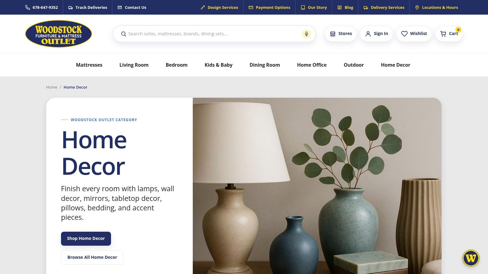
Woodstock Furniture & Mattress Outlet's wall decor collection includes framed art, floral pieces, canvas art, abstract designs, and other decor suited to boho and transitional rooms. Names such as Uttermost and Signature Design by Ashley give shoppers recognizable starting points, while the range of styles makes it easier to choose between a quiet botanical print, a modern abstract, or a more decorative focal piece.
Why ready-made art can work
Ready-made art is useful when you need consistency. A framed print can echo the warm wood of a console, while a floral piece can soften a leather sofa or clean-lined sectional. The trade-off is flexibility. These works are designed for broader interiors, so they may feel less distinctive than a handmade commission or vintage find.
Woodstock's Design Center, Room Planner tools, and in-store guidance can also help you judge scale before you commit. That matters because online images can make a piece look larger or smaller than it is, and finish details can be difficult to assess on a screen. Inventory and specific styles may vary by store or online, so checking availability is part of the process.
Practical rule: Choose the wall first, then the art. A piece that looks balanced on a product page may feel undersized above a wide sofa or overpowering on a narrow wall.
The regional convenience can be useful for shoppers in Georgia who want to compare decor with existing furnishings, arrange pickup, or discuss professional delivery and setup. If pets share the home, consider the frame, surface, and placement alongside these art selection tips for pet owners. This approach is best for someone who wants a coordinated room update without relying on one-of-a-kind sourcing.
2. Etsy
Handmade boho wall art solves a different problem. Your room may feel generic because its accessories look interchangeable, or you may need a specific size, color, or material that standard collections don't offer. Etsy's marketplace is useful for searching across independent makers, vintage sellers, and custom artists in one place.
You'll find macramé hangings, woven and textile art, rattan wall baskets, wood pieces, printable designs, and custom commissions. A seller may be able to adjust the dimensions, change the color palette, or personalize a design. That makes Etsy a strong option when your wall has an unusual proportion or your room already contains a meaningful palette, such as clay, olive, cream, and walnut.
The marketplace also supports different levels of commitment. A downloadable print can be printed locally and placed in a frame you already own. A woven wall hanging can add softness to a rental without requiring a heavy frame. A commissioned piece can become the personal detail that prevents a gallery wall from feeling assembled from a single catalog.
What requires careful checking
The trade-off is inconsistency between sellers. Review the material description, finished dimensions, hanging method, care instructions, production timeline, and return policy before placing an order. Product photographs can also make texture appear more substantial than it feels in person.
- For a custom piece: Confirm whether the seller sends a proof before production.
- For textile art: Ask how the piece should be dusted and whether its fibers shed.
- For a printable file: Check the permitted print size and whether the frame is included.
- For vintage decor: Look closely at condition notes, hardware, and color variation.
Etsy works best when you enjoy the search and can tolerate a longer decision process. It gives you more room for individuality than a standardized collection, but the responsibility for evaluating provenance, construction, and delivery rests largely with you.
3. Society6
A room can also feel disjointed because its wall art lacks a common visual thread. Society6 addresses that problem through a print-led approach. You can begin with one design or artist and apply it across different formats, making it easier to create a gallery wall that feels related without making every image identical.
Browse Society6's boho wall art selection for posters, framed prints, canvas, and wall tapestries. Style filters can help narrow the search toward botanicals, abstracts, nature motifs, or other directions that suit a relaxed interior. The same artwork may be available in an unframed format for a flexible project or as a finished framed piece when you want less assembly.
A practical way to build cohesion
Start with one image that contains two or three colors already present in the room. Then select supporting works with a similar mood rather than copying the exact palette in every frame. For example, a warm abstract can anchor a wall above a sofa, while smaller botanical or line-based prints repeat its cream and rust tones.
This format suits a renter or anyone who expects to change artwork later. Posters and unframed prints are easier to rotate than heavier textile pieces, while a tapestry can introduce a softer surface when the room has many hard materials. The trade-off is that the art is mass-produced rather than handmade. Framed choices also involve more cost and weight than a simple print, and shipping times can vary.
A cohesive gallery wall needs a relationship between pieces, not identical treatment. Repeat a color, motif, or mood, then vary the scale and frame.
Society6 is a practical middle ground between custom sourcing and a fully coordinated store collection. It offers broad visual choice, but you'll still need to check the actual dimensions, frame finish, and hanging weight for each selected format.
4. Minted
Sometimes the wall doesn't need more objects. It needs one confident focal point. Minted is suited to that situation, particularly when you want an airy, elegant boho room built around a large print or canvas rather than a dense arrangement.
Minted's art collection focuses on independent artists, limited-edition prints, canvases, and designer-style framing. Available formats range from smaller prints to large statement pieces, with options such as paper, canvas, and different wood finishes. This lets you choose whether the artwork should blend into a pale wall, warm up a neutral room, or create contrast against a darker paint color.
Use scale to create calm
A large abstract with curved forms can echo a rounded coffee table or arched mirror. A botanical work can bring organic movement to a room filled with straight shelving and rectangular upholstery. Because the piece carries more visual weight, the rest of the wall can remain relatively quiet.
The advantage is predictability. Framing choices and presentation are easier to assess than they are with many independent listings, and concierge or framing support may reduce uncertainty around a large purchase. The limitation is category range. Minted leans toward prints and canvas, so it isn't the natural destination for macramé, woven baskets, or heavily tactile wall hangings.
Large or framed pieces can also increase the overall cost quickly. Measure the wall, furniture below it, doorway clearance, and the route into the room before ordering. A focal piece shouldn't merely fit the wall. It needs to arrive safely, hang securely, and leave enough breathing room around its edges.
Choose Minted when the decorating problem is lack of scale or direction. One substantial work can give a living room, bedroom, or home office a clear center without making the space feel crowded.
5. Urban Outfitters Home
A room may have the right bones but still feel too formal. Hard furniture, bare paint, and smooth surfaces can make a space seem unfinished even when the layout works. Urban Outfitters Home offers a quick way to add softness, pattern, and a younger interpretation of boho style.
Explore Urban Outfitters Home wall decor for tapestries, tufted textile pieces, pennants, framed prints, and other ready-to-hang accents. Textile decor is especially useful above a bed, beside a reading chair, or on a wall that needs visual warmth without the rigidity of another framed object.
A tapestry can cover a broad area and introduce color at once. A tufted piece can add depth beside smooth plaster or painted cabinetry. Smaller pennants and prints can fill narrow spaces that wouldn't support a large canvas. These options also make seasonal or temporary updates easier, especially for renters who want a visible change without committing to permanent alterations.
Match the mood to the room
The trade-off is style direction. The collection often leans youthful and trend-aware, so some pieces may feel too casual for a traditional room or too playful for a restrained modern interior. Quality and longevity can vary by item, and these designs generally don't emphasize fine-art archival specifications.
Use the material as a design tool rather than adding texture automatically. If the room already has a heavily patterned rug, choose a quieter textile. If the furniture is mostly linen, cane, or smooth wood, a tufted wall piece may provide the contrast the room lacks.
This approach works best when the problem is a lack of softness or an easy update. It can also support a layered rental-friendly wall, provided the hanging method suits the item's weight and your lease allows the necessary hardware.
6. Anthropologie
A single memorable object can personalize a room more effectively than a wall filled with anonymous decoration. Anthropologie is aimed at that kind of decision. Its wall art and textiles often bring a globally inspired, eclectic character to spaces that need a stronger point of view.
Anthropologie's home collection includes vintage-inspired prints, artist collaborations, textile pieces, gallery wall groupings, and statement-scale options. These can suit a living room with collected furnishings, a bedroom that needs a distinctive focal point, or a dining area where the wall should carry some of the room's personality.
Let one piece lead
If you choose a highly decorative or oversized work, avoid competing with it immediately. Give the piece room around its edges, then repeat one quiet element elsewhere. A warm wood frame might connect with a sideboard. A muted botanical tone might reappear in a cushion or ceramic object. The supporting items should make the art feel at home, not challenge it for attention.
The benefit is memorability. A distinctive work can become the detail visitors remember, especially in an eclectic room where furniture and accessories already vary. The trade-offs are practical. Many pieces sit at a premium price point, popular designs may become unavailable, and oversized items may involve additional delivery considerations.
For a statement wall: Let the art be unusual, then keep the surrounding choices simple enough to show why you chose it.
Anthropologie makes the most sense when your problem is a room without a personal focal point. It isn't the most flexible route for someone who needs inexpensive art for several walls, but it can help define the character of one important area.
7. World Market
Natural texture can be difficult to add without making a room feel overly rustic. World Market offers a middle path through globally inspired wall decor that combines canvas, embroidery, woven surfaces, macramé-friendly forms, warm wood, and rattan-compatible accents.
Browse World Market's wall decor for pieces that can work beside cane seating, mango wood furniture, woven baskets, or jute textiles. An embroidered work adds softness and pattern, while canvas art provides a cleaner surface. A warm wooden frame can repeat the tone of a console or dining table without requiring every accessory to come from the same collection.
This is a useful approach when the wall feels cold or disconnected from the furniture. Instead of introducing another color, you can repeat a material already present in the room. For example, woven art can connect to a rattan chair, while a wood-framed canvas can echo a timber coffee table.
Check availability before planning the wall
Stock can vary by location, and some pieces may be available only online or only in stores. Measure carefully and confirm the hanging hardware before building a multi-piece arrangement. The selection also includes fewer one-of-a-kind artisan pieces than an independent marketplace, so shoppers seeking provenance or a commissioned design may want to look elsewhere.
World Market is best for adding warmth and natural texture with a manageable budget. It can help fill a larger wall without forcing you into a single oversized artwork, especially when you combine one textile piece with a smaller framed print or woven accent.
Boho Wall Art: 7-Store Comparison
| Source | Ease of Acquisition | Resource Requirements | Expected Outcome | Ideal Use Cases | Key Advantages |
|---|---|---|---|---|---|
| Wall Decor – Home Decor (Woodstock Outlet) | In-store or online with design staff support; low complexity | Moderate, value pricing, possible delivery/setup fees | Designer-look, ready-to-hang pieces that coordinate with rooms | Quick room updates; shoppers wanting designer style without markup; regional pickup | Curated brands, design tools, local pickup & pro delivery/setup |
| Etsy | Online marketplace; requires seller communication, moderate complexity | Wide range, low (printables) to high (custom commissions); variable lead times | Unique, handmade or custom pieces with artisanal character | One-of-a-kind commissions, bespoke sizes/colors, small-batch finds | High customization, diverse materials, genuine handmade options |
| Society6 | Simple online ordering; low complexity | Low–moderate, affordable prints, frequent promotions | Cohesive, budget-friendly gallery walls from independent artists | Quickly building a themed gallery wall or multiple matching prints | Multiple formats per design, easy browsing, frequent sales |
| Minted | Curated checkout with framing choices; low–moderate complexity | Higher, archival prints and premium framing increase cost | Predictable, high-quality framed or canvas statement art | Large-format focal pieces, long-term investment in presentation | Archival materials, designer framing, limited-edition works |
| Urban Outfitters (UO Home) | Easy online/in-store purchase; low complexity | Low, accessible price points and frequent sales | Trend-forward, youthful boho textiles and decor | Seasonal refreshes, layering texture in casual spaces | Affordable tapestries/textiles, strong trend curation |
| Anthropologie | Boutique/online curation; low–moderate complexity | Higher, premium pricing and occasional shipping surcharges | Distinctive, eclectic statement pieces with luxe materials | Curated, design-forward rooms needing a memorable focal piece | Artist collaborations, elevated global-inspired designs |
| World Market | Available online and in stores; low complexity | Low, value-friendly with frequent promotions | Textural, globally inspired decor that complements warm wood/rattan | Budget-conscious textural updates and larger wall pieces | Good value for textured items, natural-material accents, in-store pickup |
Build the Wall Around Your Room
Good boho wall art starts with the problem in front of you, not with a product category. Decide whether the wall needs texture, color, scale, or a personal detail. Texture may come from macramé, embroidery, tufting, or weaving. Color may come from a botanical print or warm abstract. Scale may require one large canvas rather than several small frames. A personal detail might be a vintage find, a custom commission, or a piece connected to a meaningful place.
Choose one anchor piece before adding supporting art. The anchor doesn't have to be the largest object, but it should establish the wall's direction. A woven hanging can lead a soft, tactile arrangement. A framed abstract can set the palette. A distinctive vintage object can make a gallery wall feel collected instead of packaged.
Repeat only one or two materials or colors around it. If the anchor includes rust and cream, those tones can appear in a smaller print or nearby textile. If the frame is warm wood, repeat that finish once elsewhere. Too much repetition makes boho decor look staged, while too much variation creates visual noise.
Test before you hang
Cut paper templates to the size of each frame or textile and attach them to the wall with removable tape. Stand where you'll usually view the arrangement, then check the relationship between the art, furniture, windows, doors, and walking paths. This simple test can reveal that a planned gallery wall is too high, too narrow, or too heavy for the furniture below it.
Compare ready-made, handmade, printed, and textile options according to the factors that matter in your home:
- Budget: Prints and smaller ready-made pieces may allow gradual building, while custom and statement work require a larger commitment.
- Maintenance: Textiles may need gentle dusting, while framed prints offer a smoother surface.
- Customization: Independent makers may adjust size or color, but production times and policies vary.
- Lead time: In-stock decor may suit a quick room update, while commissions and vintage sourcing may take longer.
- Installation: Heavier frames and large pieces need secure hanging points and a clear delivery route.
Woodstock Furniture & Mattress Outlet can be an optional resource if you want to judge wall decor alongside existing furnishings. Its Design Center, Room Planner tools, and in-person guidance can help you evaluate scale, coordinate colors, and consider how artwork fits with a sofa, bed, dining set, or storage piece. You don't need to use one source for every item. The useful goal is a wall that feels balanced, personal, and appropriate for the way you live.
Start with one wall and one clear need. Choose the anchor, test the arrangement, and add only what strengthens the room's texture, color, or story.
Woodstock Furniture & Mattress Outlet offers wall decor alongside furniture and mattresses, with Design Center resources, Room Planner tools, and in-person guidance for coordinating artwork with your room. Visit Woodstock Furniture & Mattress Outlet to explore options and get practical help evaluating scale, placement, and finish.